barry lyga

Cover Stories: UnSoul'd by Barry Lyga

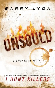
UnSould_smBarry Lyga's UNSOUL'D is about a mid-list author in his 30s who sells his soul to the devil for the promise of fame, fortune and fans. It's actually my life story but Barry changed the main character to a guy. KIDDING! But, um, I can relate to the protagonist's impulse. The book is also published by Barry himself, so he had complete cover control. Here's his tale:

"I tend to like very simple, stark covers. If you look at books like BOY TOY or I HUNT KILLERS, they really have single overriding images or big, potent type treatments. I love those covers. So for UNSOUL'D, I was always envisioning something incredibly simple: Just the title on a white background, to make you really think about that word. And then I screwed it up a LOT before I finally got it right.

"I know just enough Photoshop to be dangerous, so I sort of put together a quick mock-up of what I wanted. And I hated it. So, instead of text on white, I tried text on black. That looked a little better, so I tried adding some flames at the bottom. It still didn't look right, though. I realized that my poor Photoshop kung fu wasn't up to the task, so I talked to the woman who did the covers for I HUNT KILLERS and GAME, but we weren't going to be able to coordinate things in time.

"Fortunately, I had just met Lisa Amowitz at a bookstore event. She's a debut YA author, but also a professional cover designer. When I mentioned UNSOUL'D, she said she'd be happy to do the cover.

"I gave her my pathetic mock-up and said, 'But, you know, GOOD.' And she went to work.

"I was really stressed out. I've had input into covers before, but now, for the first time, I was 100% responsible. There was no editor to say, 'Nah.' No agent to tell me what worked or what didn't. No marketing people to offer suggestions. It was exhilarating to be out there on my own, but also frightening. If I said, 'That's it,' then that was it -- no one would or could overrule me, and the book would rise or fall on my tastes alone.

"Lisa did a slew of different variations on that original mockup (see two below), and they were all perfectly fine, but there was just something gnawing at the back of my brain and I couldn't figure out what it was. Then Libba Bray looked at the eight or nine mockups Lisa had done and said, 'You know, these are really dark. And your book is dark, but it's FUNNY.' And the proverbial light bulb went off.

Unsoul'dcompRound3.1  Unsoul'dcompRound4.1

"I called Lisa and said, 'Look, you've done some cool covers here, but I want to try doing one in white instead of black.' Which, you know was the original plan before I mucked things up by playing around in Photoshop. 'Can you try one like the words are burned into paper or something?'

"Within less than twenty-four hours, she sent me the final cover. And it was just perfect. I could have saved her a lot of work and me a lot of stress if I'd just told her my original idea from the start!

"I love the cover! Absolutely love it. It harks back to my very first idea, but Lisa took it in a totally new direction, making it tactile, giving it heft and dimension as opposed to just flat text on a white backdrop. Now it's simple and bold, but without being dull or generic.

"I don't know if it's my computer screen or my aging eyes, but for some reason the word 'UNSOUL'D' on the cover seems ever-so-slightly blurred to me. Just the tiniest bit less crisp than the rest of the cover. Which I actually think is cool for a book that's all about the gray areas of morality. I imagine it's just the way my eyes perceive the particular combination of colors and lines on the cover, but I'm a fan of it anyway."

Thanks, Barry! I love hearing how an author who had complete control navigated the process!

You can get UNSOUL'D in any ebook format you like! Want to read a big excerpt first? You got it.
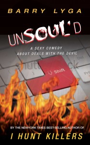
Photo Friday: Moonlighting!

A few weeks ago I was talking to author Barry Lyga about his amazing new option deal for Boy Toy, when he indicated that I probably was too young to know the great show that Glenn Gordon Caron, the person who optioned Boy Toy, had created."What show was it?" I asked. "Moonlighting," said Barry. Um, that was only my favorite show when I was a kid! I even used to write spec scripts with my friend Ciji (I made her play Bruce's character -- I was bossy). I believe I went on and on about how much I loved the sparring between main characters David and Maddie, and I promised to dig up an old photo that I knew I had somewhere... Well, here it is--proof of my fandom, complete with coffee-ring stain and pushpin holes in the corners. Moonlighting.jpg That's cardboard Cybill and Bruce (in formalwear), plus my friend Becky (in stripes) and me (in yellow "Party Time" alligator tee, naturally) hanging out at a county fair. Congrats to Barry on the option, and Happy Friday! I leave you with the intro to an amazing 80s show (Shoulder pads! Mercedes! Bruce Willis with hair!):

Cover Stories: Goth Girl Rising by Barry Lyga

GGR final.jpgThe awesome Barry Lyga is here today, sharing the Cover Story for his just-released sequel to The Astonishing Adventures of Fanboy and Goth Girl, Goth Girl Rising. (He's also giving away some insanely cool Goth Girl minimates! Read on for details...) Here's Barry!

"For my cover, I had an idea that, in retrospect, is one of those things that sounds cool, but wouldn't work. My idea was to co-opt the cover to the first book, but reverse it: Red lips on a black background for the hardcover, then blue lips on a black background for the paperback. It totally makes sense from a story point of view, but now I think it's too cutesy.

[Here are the first book's covers, hardcover (left) and paperback:]

fanboy.jpg fanboypaperback.jpg

"Speaking of that first book: I had some strong ideas for that one, to the point where I even had a friend of mine mock one up. Houghton politely declined it and commissioned Jon Gray to produce the kick-ass cover we ended up with (way above). I have never in my life been so happy to be proven wrong!

"Houghton has always consulted with me about covers, which I really, really appreciate. Like I said, they weren't too keen on my original idea (which I don't blame them for). So they sent me three or four different cover designs, all based on the same general aesthetic. I wasn't thrilled with any of them. There was nothing WRONG with them; they just didn't seem like the cover to my book, you know? "We went back and forth a few times and my problem was that I just couldn't articulate what I didn't like or what I wanted to see instead. So I just resigned myself to having a cover I didn't like. I told my agent this and she spoke to my editor on my behalf, explaining I wasn't happy with the covers and offering some suggestions of her own.

"The next thing I knew - I mean literally within hours - my editor sent along the photo that ended up becoming the cover. The instant I saw it, I fell immediately and irretrievably in love. I think the first thing I said was, 'Oh my God! Kyra is real and they found a picture of her!' It turns out to be a stock photo that my editor found just by poking around. It was just a massive chunk of serendipity dropped into our laps.

GGR first.jpg"They took that picture and did two versions of the cover, one of which ended up being the final cover. The other one was just as good, in my estimation, and had a big black block sort of weighing her down and closing her in. In the end, though, the model is just so damn striking, her eyes so haunting, that everyone agreed that it was best to show her as big as possible.

"I think the only thing I asked was if we could Photoshop in Kyra's facial piercings - her lip ring and nose stud. The art department gave it the old college try, but it just didn't look right. It looked, well, like someone had Photoshopped in that stuff. So my feeling - and what I tell fans - is that Kyra just decided to take them out the day that picture was taken.

"It's really so perfect that the piercings, to me, are a minor issue.

"Now that I've seen the actual, physical cover, I love it even more. I love the font, the raised type, the shiny lipstick. I love the details, the little elegant graphics that wrap around the spine. It's my favorite of the covers I've had so far. If you could marry a book cover, I'd be on my honeymoon right now."

I agree that the final cover is truly striking -- her eyes are kind of boring into my soul, and I love the violet hues. What do you guys think? How do you think it compares to the first book's covers?

kyra_mm.jpg

Oh! Also, you can read a deleted scene from Goth Girl Rising here. (I love it when authors share these. I hope I have a deleted scene that's worth posting one day!)

For more on how to win a mini-mate (I have one, and I love her), see Barry's Share the Love Contest. Thanks, Barry!

PS-Thao at Serene Hours did a post on series covers that I just loved a while ago! Check it out. (Oh, and she really liked Goth Girl Rising, btw!) Shop Indie Bookstores