Cover Stories: Hundred Percent by Karen Romano Young

In Hundred Percent, Christine Gouda, aka Tink, is in her last year of elementary school, where she encounters standard awkwardness with a sharply realistic perspective and voice. Annie Barrows, author of the Ivy & Bean series, says of Hundred Percent, “Karen Romano Young must be twelve. There’s no other way she can possibly know what she knows about sixth grade in all its weirdness and glory.”

So how to convey Tink's world visually? Karen says the cover, with original art by Natalie Andrewson, was "a pretty excellent surprise." Here's a little more from the author about how it came to be:

“My initial reaction to seeing the cover: ‘SCREAM.  How utterly gorgeous! I love that color. It's going to be a stunning book and I am blubbing over it.’

“The cover captured Tink. In mood and approach, it felt the way the story felt to me. So I was impressed. How did illustrator Natalie Andrewson do that? What did the designer, Kayla Ferriera, say to Natalie, to get her to do that? What did the editors ask Kayla for? Stuff like this mystifies me. Also, there were different versions in terms of illustration style but I’m pretty sure the concept was always what you see. 

“We messed around with color combinations, and that was fun. We fooled with shirt and skirt styles, too. For me the most fun was the nail polish. I think it started out blue, but once we settled on a blue skirt it blended in too much. I didn’t think Tink would wear red, not her style. And I promised that if they made the nails green I would wear green nail polish whenever I signed the book at an event.

"I love that they incorporated my art (Tink’s signature on the class picture frames) into the cover.  It is also on the book’s 'undies' — the case — in white on the gorgeous yellow case, and that really touches me and makes me feel how much the book is mine. Chronicle really, really pays attention to the details and does everything in such a loving, considerate way. It’s great to be one of their authors, and I truly love my book.

"Hundred Percent has a great deal of me in it, and I had a red polo shirt that fit me like this. Also, I was always wearing buttons and badges, I thought they were fabulous when I was in junior high. My dream was to have my own badge-making machine. So the fact that Tink’s signature turned into a badge blew my mind. Tink doesn’t wear badges in the book, although Bushwhack does. So it’s like Natalie saw into my heart.

"There’s one other thing that I adore about the cover, and I really can’t tell why. I love the little button on the waist of Tink’s skirt. It just seems like such a personal touch."

Thanks, Karen, for sharing so much about all the tiny details in this cover, and how getting them exactly right creates a visual energy to match the story's. Yay, Tink! 

Read an excerpt of Hundred Percent here.

Cover Stories: Invisible Fault Lines

"My father disappeared on a Tuesday that should’ve been like any Tuesday, but eventually became the Tuesday my father disappeared.”

Kristen-Paige Madonia's second novel, Invisible Fault Lines, is set in San Francisco and tells the story of Callie Pace, a 17-year-old girl whose father goes to work one morning and doesn’t come home. It has a pretty unique cover, and the author is here to share the story of how it came to be:

"The novel started with my interest in exploring loss, but not the traditional kind of loss, not death or love lost, but ambiguous loss –- when a person disappears and you’re grieving something that has been taken away, but you’re also navigating unanswered questions. Callie is constantly wrestling with the not-knowing, and that was interesting to me. I believe there’s hope in the unknown just as much as there is heartache, and I wanted to explore that dynamic.

"Because the novel is based around those kinds of themes, I’d always imagined the cover would be a bit bleak to reflect Callie’s struggles with the disappearance of her father. Music, photography and the 1906 San Francisco Earthquake also play large parts in the book though, so I thought the cover might relate to one of those elements. When my publisher and I talked about the design, I only had two requests — the same two requests I gave them with my first novel, Fingerprints of You: no real people, and, in terms of color schemes, I asked them to shy away from pink.

"The first request, no real people, stems from my belief that, as a reader, imagining the characters is part of the process of making the book yours; it’s part of the fun. If the cover shows you exactly what the characters look like, than the reader loses the opportunity to participate in the novel in that way, to make the characters their own. And in terms of the color scheme, I personally don’t particularly like the color pink, but I also wanted to make sure we weren’t limiting our audience in any way. This book will appeal to all genders, and my hope was that they would create a cover that reflected that.

"The image is so different, so unlike any other cover I’ve seen, so my first reaction was gratitude that they took the time to create something unique. A lot of YA covers look fairly similar, so I was thrilled that this one is so different. Because, in a way, the book works as a hybrid contemporary/historical novel, and because 1906 earthquake plays such a large part in the story, I half expected them to use a historical photo or to create a split-screen image that included a contemporary image and one from the past, so I was really surprised the first time I saw the cover art.

"The last place that Callie’s father is seen is the construction site where he works, but it never crossed my mind to use that setting for the cover. But this image, the construction site and the graffiti and the posters, well it’s gritty and grounded in setting, which is a perfect fit for the story. I loved the way they used the Golden Gate Bridge and the way the posters made me think of both concert flyers but also missing person’s posters. The heart is a subtle implication of hope, and the graffiti font is so distinct. It works on so many levels, and now I can’t imagine the cover any other way.

"I was invited to make suggestions, but to be honest I didn’t have many. In the end, at my suggestion, they muted the pink graffiti color a bit and added some texture to the skyline, which made it feel more realistic.

"After all was said and done, I emailed my art director, Krista Vossen, to track down some background info on the cover. It’s always so interesting to see how it all came together! They actually did a photo-shoot for the cover, so it’s a composite of a number of construction sites that she found in Brooklyn. She designed and printed the posters and tacked them up on the construction-site walls. With the poster design, her intention was to create a hybrid of a missing persons poster and a band snipe as a nod to both Callie's father, and to Callie’s passion for music -- and of course to San Francisco.  It had just down-poured before she and her photographer, Jon Pack shot, so everything was drenched, which worked to their advantage as it weathered the posters perfectly. Aesthetically, she didn’t want it to look like a book cover and wanted the design to pull the reader directly into the world of the novel.

"In the end, I think the cover truly reflects the mood of the book. It’s unusual and realistic and mysterious, and I’m so thankful for all the work and thoughtfulness that went into creating the design."

Thanks, K-P! I love that the shoot had such lucky timing, and any cover with such thought behind it wins in my book. 

PS-Kristen-Paige Madonia's debut, Fingerprints of You, has a very cool Cover Story too!


Cover Stories: In the Time of Dragon Moon

Janet Lee Carey's new book, In the Time of Dragon Moon, has a tagline that is irresistible: Beware the dark moon time when love and murder intertwine. Hello! Sold. She's here to tell the tale of her latest cover (my favorite part is a the glorious sunspot at the top!):

"Early on I thought the cover would show a dragon circling an eerie full moon. The trouble with that image is, it simply repeats the title and doesn’t show conflict or, more importantly the central characters. (Excellent example of why I was meant to be a writer and not a cover designer!)

"My editor, Kathy Dawson, was kind enough to ask for my ideas. Early on we both agreed we wanted a dragon on the cover, something that alluded to the powerful dragon on the cover of book 1 in the Wilde Island series (see all three covers above).

"I also sent Kathy a few photos of what I imagined Uma to look like. She’s half English half Euit, so I found some beautiful images of mixed raced girls. Kathy kept the photos and also asked me to describe Jackrun’s arm scales in detail. (More about that later).

"I knew my publisher had been working hard, trying and rejecting a number of cover ideas to get just the right strong fantasy feel for the book, so I was excited to see what the talented artist, Tony Sahara, had finally come up with. When I opened the attachment, I was thrilled! 

"My editor and I asked for a few small things, mostly color tone changes. And I requested a few changes to the dragon to make him appear more powerful and a little more menacing. Tony Sahara did a brilliant job with the changes.  

"I also noticed the dragon scales on Jackrun’s arm were not like the small scalloped scales I’d described in the book. Tony drew them larger and slightly more diamond shaped. Tony’s were masculine and powerful and it didn’t take long for me to realize I liked his version better. So instead of requesting artwork changes, I went back to the manuscript, used Find/Replace and changed the sections describing Jackrun’s arm scales to match the ones on the cover. Voila!

"The artist did a brilliant job of capturing the tension between Uma and Jackrun. Magic brings them together. Murder tears them apart. At first they don’t agree about who’s behind the crimes. Later they argue over whether Uma should stay on serving the queen at Pendragon Castle or make a run for it. Knowing Uma’s life’s in danger, Jackrun wants her to run. Uma has other ideas. Both are strong-willed and stubborn – the kind of people dragons like. 'For battle is dragon’s bread.' (pg 41)

"I was also happy to see Uma in her green gown. This gown has a lot of significance in her character arc as she leaves a past of dressing like a boy behind and begins to claim her womanhood."

Thanks, Janet! Read more about the book below and watch the trailer too.

About the Book:
            All Uma wants is to become a healer like her father and be accepted by her tribe. But when the mad queen abducts her and takes her north, Uma’s told she must use her healing skills to cure the infertile queen by Dragon Moon, or be burned at the stake. Uma soon learns the queen isn’t the only danger she’s up against. A hidden killer out for royal blood slays the royal heir. The murder is made to look like an accident, but Uma, and the king’s nephew Jackrun, sense the darker truth. Together, they must use their combined powers to outwit a secret plot to overthrow the Pendragon throne. But are they strong enough to overcome a murderer aided by prophecy and cloaked in magic? 


Cover Stories: The Lost by Sarah Beth Durst

Sarah Beth Durst always has great covers (and stories) to share—just look back on her covers for Vessel, Ice and Drink, Slay, Love. Her latest is The Lost, and Sarah's here to tell the tale of that lovely cover (and Harlequin's cool process!):

"Harlequin has a wonderfully organized approach to covers.  Here's how it works:

"For each book, the author fills out an Art Fact Sheet within an online database. You need to describe the novel and its setting, plus describe 3 or 4 major characters and 3 or 4 important scenes that might lend themselves to a cover image. You're encouraged to send along images of people who resemble your characters and places that inspired you.

"I loved this process. I've never really played the who-would-I-cast game with my characters before, and it was so much fun. For my book The Lost, I picked Amanda Seyfried for Lauren -- she's my protagonist, a 27-year-old woman who gets into her car one day to drive to her dead-end job and instead of turning left at the light, goes straight and keeps driving until she runs out of gas in a town called Lost.  Lost is filled with only lost things and lost people and is surrounded by an impenetrable dust storm.  She's helped by a mysterious man called the Finder and a knife-wielding six-year-old girl named Claire.

"For the Finder, Peter, I chose a cross between Johnny Depp, Jason Momoa, and Alex Meraz.  And for Claire, I pictured a six-year-old Elle Fanning.

"I also described the town of Lost in detail: it's a rundown desert town with a kitschy diner, a dilapidated motel, an old-fashioned motel, and a single red balloon that always seems to float overhead.

"My editor then reviewed my Art Fact Sheet and sent it and the manuscript on to the art department.  I picture this as a magical place with lots of wind chimes, incense, and frolicking unicorns that deliver coffee mugs full of inspiration to each artist. 

"In reality, the artists probably have desks and computers and such, but I'm going to continue imagining coffee-bearing unicorns, if you don't mind.

"Anyway, a few months later, the cover arrived (via unicorn) in my Inbox.

"And I think the result is pure art.  It is nothing like I imagined, yet it captures the book so absolutely beautifully. The novel is magical realism, and it's written in a highly atmospheric, impressionistic, eerie style, which the cover shows. In terms of content, the town with the single balloon overhead is perfect, and the brush strokes reflect Lauren's dream of being an artist. On the finished book, the paint strokes are raised so that it looks as if paint has dripped onto the letters of the title. I keep petting it.

"There's something magical in having a cover that reflects the feel what you hoped to put inside.

"Thanks so much for inviting me here to share The Lost's cover art!"


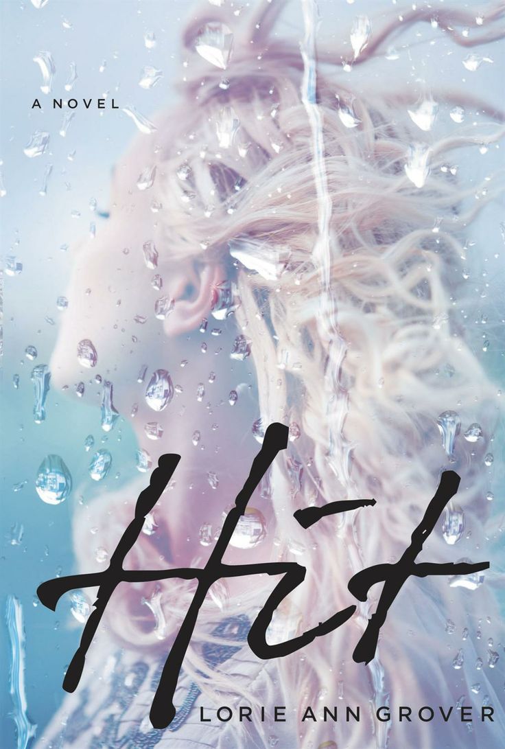
Cover Stories: Hit by Lorie Ann Grover

Just look at the beauty dripping from that cover! I had to ask Lorie Ann Grover about the design for her latest YA novel, Hit, which is out this month.

"Thanks for hosting me, Melissa! I so love the cover of my latest contemporary novel Hit. I was awed by Firstborn’s imagery and wondered if my new publishing house, Blink YA Books, a division of HarperCollins, would hit it again. And they did!

"Hit is inspired by a true story. In 2004, my daughter’s best friend, Sarah, was walking to school, pre-dawn, when she was struck in a crosswalk. Urgent brain surgery was needed. My daughter and I sat with the family through the dark trial. First, waiting through the operation, and then, waiting to see in what measure Sarah would recover. My fiction sprang out of those characters, emotions, and moments.

"When it came time to talk book cover with Blink, I provided pics, not knowing if they’d be helpful.

"Here are Sarah and my daughter, Emily.

"I also shared two of Sarah’s hospital scans which show her brain bleeding following the accident. The top image is prior to surgery, the white area being blood pooling against her brain. The second image is following the operation:

"The final cover looks nothing like either image! Although it does remind me of Sarah with her long blonde hair. It could be the moment right before Sarah was hit, or the horrifying moment just afterward. Either way it is striking and compelling.

"I was very surprised to learn my own editor, Jacque Alberta, had quite the hand in the design. Although, she points to her amazing team, and they point right back at her. J

"So that’s the story behind the cover of Hit, a book and a cover inspired by true life events. Just a quick note before I go. In my research for the novel, I came across #redthumbreminder. Steve Babcock’s simple, yet innovative solution to text safety is awesome. Embraced across the country, men and women are painting one thumbnail red to remind themselves not to text while driving. It worked for Steve, and he was able to break the habit. It can certainly work for you and me. Raise your red thumb with me and set your phone aside while driving. We might avoid one more… hit."


Cover Stories: A Blind Spot for Boys

Justina Chen has been on this blog a few times talking covers (for Return to Me and North of Beautiful), and I'm lucky to have her back to talk about the cover of her latest novel, A BLIND SPOT FOR BOYS

"As soon as I finished writing, I knew that what the book needed was a bright, eye-catching cover. One that popped on the bookshelves. One that said: I am a fun read, people! I trust my publisher on the cover. They’ve done an outstanding job designing each of my novels. I think this was the first time Little, Brown didn’t ask for my input upfront. I’m glad. They designed and delivered a perfect cover.

"Actually, they more than delivered. Not only is my title a sunny yellow, but there are hot pink accents, including a secret heart on the inside cover. The cover photo features the cutest couple on the planet who you can tell have a great time together—and that is what I wish for all of my readers. For them to know and experience a really wonderful, soul-filling love. Then there’s a gorgeous photo of Machu Picchu on the back cover—a sacred site that rearranged me when I was there with my kids on a research trip. And to top it all off, my son took my author photo on the backflap. It’s his first photo credit. So all told, I couldn’t love my cover more!

"When I received the first cover concepts, I sat back in my office chair, mouth half-open, thinking to myself, They nailed it. Only one of the cover concepts drew a less than enthusiastic response from me. The guy’s hair was terrible! Luckily, my editor agreed.

"We evaluated another photograph with booksellers, but I think the feedback was that the original cover concept that we loved the most popped better on the bookshelves. The first time I saw it at a bookseller, I thought: the cover really does pop! The art department used two stock photos and collaged them together.

"I have to admit: every time I look at A BLIND SPOT FOR BOYS, I smile. It’s my favorite book cover, which is apropos since it was the most fun I’ve ever had writing a novel. The couple on the cover share the warm ease with each other that I imagined Shana and Quattro having. As well, you can see that they’re totally flirting with each other, which is perfect since Shana is a man magnet who put herself on a Boy Moratorium. Well. That didn’t last long. And Quattro is the reason why."


Cover Stories: Amity

Micol Ostow's 12th (!) original novel, Amity, is the story of a haunted house told in two separate perspectives, ten years apart. I have read it and it is truly terrifying (and beautifully written), with a cover to match. Here's Micol with the story:

"I think we all always knew Amity was going to have an image of a haunted house on the cover. It’s iconic and classic for a reason, right? We may have tossed around the idea of focusing in on one aspect of a house – a window, a door – or even doing something more modern and all type, but I don’t think any of those concepts were seriously on the table.

"My editor at the time showed me an early mock-up with the image they were planning to use (right). She made it clear that everyone in-house was very enthusiastic about the image, which, as I know from my own days on the editorial side of the desk, is pretty crucial and not to be ignored.

"I liked the general idea of that first cover and I really liked that Egmont was truly capturing that straightforward, 'HORROR novel,' genre vibe. My main concern was only that the house itself looked nothing like the building that’s described in the book, or the original 'Amityville' house. Specifically the half-moon windows are mentioned a whole bunch in the book, and are familiar to anyone who knows anything about the original Amityville crime. But I can appreciate that a strong cover can often outweigh the value of a literal cover. We talked a bit about how the house in the mock-up looked small and not quite menacing enough, and my editor assured me it would be tweaked.

"And it was! And it’s amazing and perfect!

"As you can see, the final cover is the same original image. But with the color adjusted, a new font, and lots of creepy blood dripped, the terror factor is amped way, way up. I could seriously marry this new final cover, and I’ve been thrilled with readers’ reactions to it! The general consensus seems to be that it’s insanely scary. Which to me translates to: mission accomplished!"

Cover Stories: The Princesses of Iowa

The paperback release of The Princesses of Iowa by M. Molly Backes reminded me how much I really like this simple cover. There's such a sense of space there. So Molly's here to share her story, and it's a good one!

"I never thought about the cover as I was writing The Princesses of Iowa because I never believed it would be a real book. When I wrote the first draft, I was teaching middle school and living in a cabin in the mountains of New Mexico, far away from friends and family. It just seemed like a good way to pass the time—I honestly had no idea that it would ever be published.

"My editor asked me to send her some book covers that spoke to me, so I spent an hour in a bookstore (Page 1 Books in Albuquerque, yay indies!) looking at books and snapping pictures of the ones I loved. My favorite was Emily Horner’s A Love Story Starring My Dead Best Friend (below right) – I loved the brightness, the colors, and the sky, as well as the vintage elements.

"This is the email I sent to my editor, along with a few images of covers I liked:

"When I started looking around at other contemporary YA covers, I found that I was very drawn to anything with an open feeling and some skybecause Iowa is so much a part of the book's personality, I imagine some element of it represented, whether that be a sense of openness or blue sky or I-80 (the highway that runs through the state) or a cornfield in the background or whatever else. On the other hand, Princesses is not a “country” storya lot of the action happens in the suburbs, around the high school, and in Iowa City, so I think the most important thing is that the cover capture a Midwestern vibe, but that there are other things going on design-wise/in the foreground that are really engaging and reflect other elements of the story in addition to place.

"Some other images that I think are interesting and that draw from key scenes in the book are: the road, the truck stop, cars (a huge part of high school culture everywhere, but especially in the Midwestplus obviously the two crashes), notebooks, and the outdoors in general (suburban house parties, bonfires, views from car windows, the golf course, the secret springs in the woods, the river in Iowa City, etc). I also like the juxtaposition of fancy & ordinary in the titlethe girlyness of "Princesses" and the non-pretentiousness of “Iowa.”

"The only cliché that really bothers me in a lot of contemporary YA covers is the convention of showing a girl with no headit’s a little troubling from a feminist perspective. :-)

"Looking back on this, I’m struck by how much the designers incorporated. They have the blue sky, the Midwestern element (a wheatfield; after the book was published some Iowan readers pointed out it should have been corn or soybeans. Probably true!), the road, the car, the outdoors. They did the juxtaposition of girlyness and unpretentiousness with the fonts: the little curlicues on “The” and “of” and the straightforwardness of “Princesses” and “Iowa.” And instead of a headless girl, they gave me just her head! Her eye, staring straight at you. I love the power of that. (Oddly, I am constantly asked if the girl is me, even though she has bright green eyes and mine are dark brown. And she’s seventeen and I’m… older than that. Maybe it’s the hair? I don’t know.)

"The first time I saw this cover, I was alone in the house, with the dog napping on the loveseat. As soon as the file loaded, I gasped and said, “BLUE SKY!” and woke the dog up. Second reaction: “It’s so PRETTY!”

"I loved it immediately, but the longer I looked at it, the more I saw. First of all, the landscape is so beautiful and slightly melancholy, which fits just perfectly. Someone at a reading once asked me, “I notice that you describe Iowa as being very beautiful. Why did you choose to do that?” I said, “Well, I suppose it’s because I find Iowa to be very beautiful.” It is! 

"The sky takes up about two-thirds of the cover and the field about one-third, which is a common and visually pleasing ratio, but then the car’s mirror interrupts it in an interestingly jarring way, just as the events of the story interrupt Paige’s peaceful life. So much of this story is about Paige examining herself and her life through the lens of one moment: a car crash, everything that led up to it, and everything that has happened since. She goes back to that moment again and again, so it’s perfect that she’s looking in the rearview mirror. She’s looking at herself! In a car! Going forward but looking back! I love it so much."