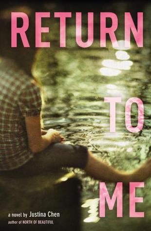
 Justina Chen pours her heart into her novels, as all writers do in some way. But this latest one? It really is her heart. Read the back story about the novel here, and check out the Cover Story below. Thanks, Justina.
"After toiling over RETURN TO ME for the better part of two years, mostly at four in the morning when the world was dark and dormant, I took myself off to Hawaii. There, in the high-sheen sunlight, I came across a red tropical flower that arrested my heart: the ohia lehua. It wasn't the color or the shape of the flower that enthralled me, but the tenacity of that flower, growing stubbornly in a field of hardened, black lava. So at one point, I could imagine that flower in the background of the book cover. Either that or a close-up of a fairy house, which my protagonist--an aspiring architect named Reb--crafted from found materials in the garden: twigs, leaves, pine needles.
 "All that said, I have the utmost respect for Little, Brown's art department. Amazing designers, including RETURN TO ME's Tracy Shaw, have done outstanding jobs, translating my words into a singular image for every one of my book covers. I mean, isn't North of Beautiful gorgeous with the compass rose overlaid atop Terra's cheek? [Read the Cover Story.] And Girl Overboard--could there be any other cover but that one? So I knew that I should just stay mum when it was time for the art department to get involved and allow the creative geniuses free reign over their magic.
"Smart move! My editor showed me one concept and one concept only for RETURN TO ME. As soon as I saw the pdf, I knew the concept was The One, my story's soulmate. It's not just the cover I adore, but the entire designed book right down to the perfectly architected font, page layout, and interior pages. The interleaves separating the three sections of the book are so beautifully designed, I teared up when I viewed them the first time. So you can only imagine how I felt when I held the hardbound book in my two hands: it was as if my heart had returned to me, better than before."
Thank you, Justina! I love the faded and fuzzy parts of this cover, almost like a filter that makes it dreamlike in parts, sharp in others. I also really like the light play on the water and the pink translucent lettering of the title. What do you guys think?