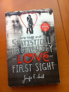
 I know that everyone has read The Statistical Probability of Love at First Sight by Jennifer E. Smith, and I need to GET ON THAT! Because I know I'll love it -- I've heard her read from it, I've seen the reviews, it's a sure thing. And the cover? I think it's pretty timeless.
Here's Jennifer to talk about how it came about:
"I’ve realized I’m not all that visual a writer, so I’m always more than happy to let the pros handle this aspect of the process. Because it’s a love story, I guess I was just hoping the cover wouldn’t be too cheesy. I think I probably mentioned my aversion to seeing a photograph of the main characters… I tend to prefer graphic covers to photographic ones, and I never like seeing the characters too clearly – I’d rather let the reader come up with their own ideas about what they look like – but beyond that, I hadn’t really given it much thought.
"When I saw the cover, I absolutely loved it! It wasn’t final at that point, but the concept was just brilliant. You could see the characters, but not their faces, and they were far enough away that it wasn’t the main focus. What I loved most was the title treatment, which gave it some quirkiness and really made that the focal point, which I thought was cool. I think we originally saw a second option with a red background (instead of the black), but we all quickly honed in on the black version and moved forward with that one.
"They were really enthusiastic about it, so I think they were happy I felt the same, and all my comments and suggestions were really just tweaks. In the original image, the girl had dark hair and was wearing a long coat, but in the story, Hadley has blond hair and it’s summer. And there were also a few too many frills to the title, so we suggested revising that slightly. But for the most part, I was just really pleased.
 "The early image was used for the galley, actually (see the galley at right), just because of the timing, but they made all revisions I suggested for the final version, and I think it turned out brilliantly. The designer, Liz Casal, is a genius. She’s working on my next one too, and I couldn’t be happier.
"I know it doesn’t always happen this way, and in fact, it hasn’t for many of my books, but in this case, the first concept they showed me was a knockout, so it was a pretty easy process all the way through. I think the original image of the couple was a stock photo, and then they manipulated it to make her blond and change her outfit just slightly. The title treatment is hand lettered, which I love.
"I adore the cover. It’s romantic and cinematic and eye-catching, and I think it really captures the feel of the book, that sense of time slowing down when you’re with someone, and the way the rest of the world becomes a blur all around you. It’s a great cover – I got really lucky!"
Thanks, Jennifer! I love that the detailed tweaks got made, and the final fonts are a total win too. Little changes do a lot.
What do you guys think of this cover?
PS-Here's a sneak peek at some of the international covers for this book. See the full covers on Jennifer's website.
