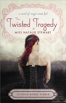
 Leanna Renee Hieber has some amazing titles, like her latest: The Twisted Tragedy of Miss Natalie Stewart, and the covers have to match those intriguing introductions to her stories. Here's Leanna to talk about her most recent cover concept:
"I didn't have a cover in mind, because the cover for the first book, Darker Still [read that Cover Story], went through SO many changes that I just figured I'd sit back and see what the marketing team came up with. In my heart I wanted something Gothic and something that portrayed a historical novel, whatever that might be.
"When I saw the cover, I loved it from the first. It's beautiful, classy and Gothic. It's my favourite cover I've ever had. I suggested the hair be toned down a bit as Natalie is auburn, not red, but I think the red ended up staying as it matched the red in the other parts of the cover.
"There was just a font change, and I couldn't have known about the beautiful sheen on the cover, or the beautiful wallpaper interior. Those are wonderful touches.
"I really adore this cover. The subtle wall-papering across the whole book is so lovely. Even the spine is gorgeous, all the details on the inside and outside make it really special and I think it truly stands out. It really fits my Gothic voice as an author. (And as someone who owns 10 black corsets. I'm not kidding). Lots of folks have asked if it was me posing on the cover, which made me laugh. While I do have several corsets just like that, it's not me. :)"
Thanks, Leanna! I love the wallpapering and the title treatment on this one the most. They feel like very thoughtful parts of the package.
What do you guys think?
PS-Trailer!