Trish Doller has a new book out this month with a gorgeous cover. I loved her debut, Something Like Normal, and this one is on my fall must list. So, naturally, we talked:
 "While I was still working on the book, I fell in love with the image on the cover of The Sharp Time by Mary O'Connell (right), which was taken by a photographer named Metin Demiralay. I was browsing his gallery when I found an image of a girl standing against a barbed wire fence. Demiralay's work is very color-saturated and edgy and I loved the symbolism of a girl being held back from a normal life by a painful past.
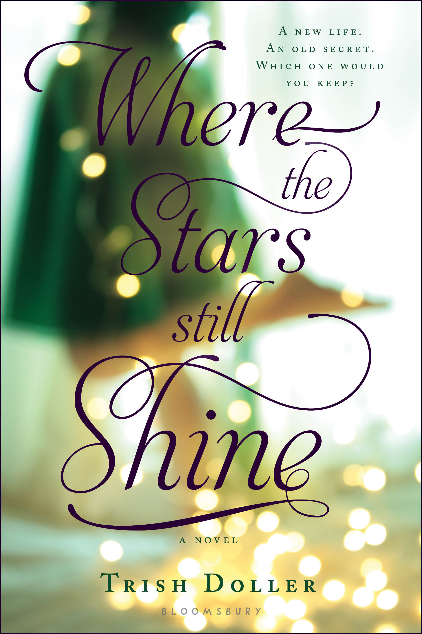
"Once I turned in the manuscript, one of the first emails I received from my editor had a photo attachment of an image she thought would be perfect for the book. We hadn't talked cover and I hadn't shown her the Demiralay yet, so I wasn't sure what to expect. The image was of a couple draped in fairy lights...and one I recognized as the cover for Uses for Boys by Erica Lorraine Scheidt (below, left). Obviously we couldn't use it, but it was clear that the tone Bloomsbury was going for was much softer than a girl behind a barbed wire fence. So instead of showing my editor the Demiralay image, did a search for fairy lights, and discovered a UK-based photographer named Beth Retro who shot a whole set (Preview) of fairy lights. When I saw the green dress image, I promptly fell in love and sent it to my editor who had the same kind of 'ooh!' reaction that I did.
 "Having gone through a LOT of different cover comps with Something Like Normal, I didn't want to get my hopes up, but every time I sent my editor a different idea--just in case--she'd say, 'No, I think I like the first one better.' So when I saw the cover treatment for the first time, I wasn't exactly surprised by the image, but the font was more beautiful than I could have imagined. Being a bit of a design geek, I learned that the name of the font is Aphrodite. Even though designer Regina Flath didn't choose the font because of the name, the fact that Aphrodite is the Greek goddess of love and the characters in STARS are Greek-American made the font feel really special to me. Additionally, fairy lights play a small but significant role in Callie's story, so I love that the cover is not only beautiful but representational.
"There has only been one minor change--the addition of the purple stripe near the bottom of the cover--so what readers will see on shelves is almost exactly what I saw that first day. I've spent a lot of time with this cover but I'm still head over heels for it. I love everything about it. It feels mature, yet still young adult, and I'm happy that it's romantic without featuring a couple or kissing. It's pretty rare that everyone--from the author to editorial to sales--shares the same vision when it comes to a book's cover, so I'm thrilled it happened like this."
Thanks, Trish! I love the blurry romance of this cover. What do you guys think?
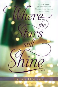
PS-See below for first design vs. final (the byline stripe change Trish mentions). Subtle but important.