 Andrea Seigel had some visual ups and downs with her novel The Kid Table, but she ended up with what I think is a really clean, funny, standout cover.
Here's how she got there:
Andrea Seigel had some visual ups and downs with her novel The Kid Table, but she ended up with what I think is a really clean, funny, standout cover.
Here's how she got there:
"I read your blog all the time, so I know a lot of authors say they're not visually oriented, but I always have covers in my head. In Kid Table one of the main characters tries to burn the table with a lighter, so probably the first image I pictured was of a magnified formal place card with the book's title in fancy lettering, but the place card destroyed with charred edges, chewed gum stuck to it, etc.
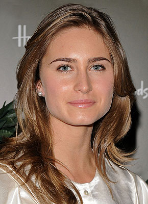
"Bloomsbury told me they were scheduling a photo shoot, so they asked what I thought Ingrid, the narrator, looked like and how she dressed. I started to get nervous at that point because I'd never pictured a cover with an actual person on it, but something more conceptual instead. I told my editor that Ingrid wasn't traditionally cute--in the book she says that she'll get called handsome a lot when she gets older--and I gave them actress Emily VanCamp and model Lauren Bush as examples. These were the pictures I sent. You know, strong nose:

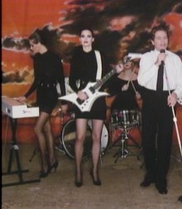 As for Ingrid's clothes, I said she dresses like one of the Robert Palmer video girls (right). In the first event of the book, her hair is slicked back with gel, and she's described as going for simple, sleek mini-dresses.
"When I saw the cover mockup (below left), I had a major meltdown. The emailed image came into my box minutes before I was leaving to drive out to the desert to teach a class, and I just thought, 'Nononononononono.' 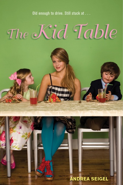 I called my boyfriend over to look at the laptop. He said, 'Oh. No.' I'm, uh, fairly emotional, so I immediately hit reply and basically told Bloomsbury that the cover was murdering me. And then seconds later an email showed up from my agent that was like, 'Maybe you should have slept on your response?' But during the three-hour drive out to the desert, I only got more worked up.
"I had a huge problem with the girl's styling. It was incredibly off for me. The girl wasn't right either. I took a print-out of the cover to the desert with me and showed it to a few people that day, and most everyone had comments like, 'Oh, you write a book on babysitting?' Or, 'This looks like something I might buy for my niece, who's in fourth-grade.' At that point I sent another email to Bloomsbury saying that I would reimburse them for the photo shoot if they'd let me have cover control. They didn't take me up on that, but they did agree to keep working on the cover. So then we went through a few rounds where they tried to work with the material from the photo shoot:


"But I just couldn't get past the girl. (Let me just clear things up here--the model herself is super cute. I'm sure everyone wants to date her at her school.) But those shoes, those tights, that dress--they were killlllllllling me. My agent, who was so great and supportive through all this, stood behind me and said, 'The girl's got to go.' I wasn't sure it would happen. I starting leaning toward the version with 'The Kid Table' in the big white letters because it blocked out as much of the photo as possible. And then a couple weeks later I was walking my dog and a completely new image showed up on my Blackberry.
"I kissed the top of my dog's head in relief.
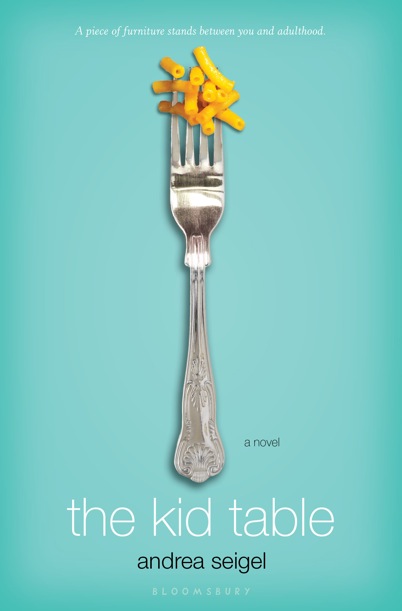
"I'm not going to lie. I'm a pain in the ass, and I'm nitpicky. So I asked to see some more edgy combinations of objects/foods to intensify the contrast between adult and teen worlds (my mom served me Kraft on her good silverware, so the combo didn't shock me), but by that point, I think my publisher wanted me dead. So they politely said that the macaroni was staying put. Then I just asked that my name go in black and that we add 'a novel' so readers wouldn't think it was a cookbook. We also went back and forth a bunch of times over the final tag line because I felt the originals were too cutesy.
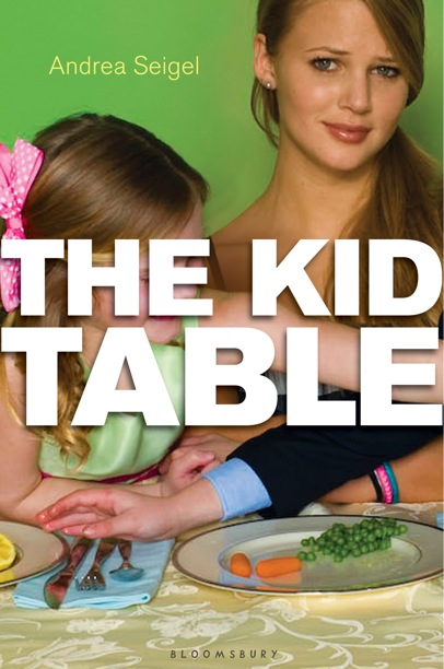
"And this is where we ended up:
"The new cover is a combination of two stock images, and it is such a clearer representation of the book, which is on the older spectrum of the YA age group and also pretty dark-humored--the narrator, Ingrid, is a maybe sociopath, but you would never get any sense of that angle from the original cover. The new one, though, it conveys a much wryer perspective; it's in keeping with the tone set by the narration. (I also have a longstanding fetish for anything on the seafoam/aqua spectrum because these were the colors of teenage bedroom (a strict marine-life decorating scheme), so I'm totally on board for the blue-green here.) It was so, so important to me that the cover reflect the material inside because I didn't want to sell the book on a false front. I feel like the cover is honest now.
"So in the end, I'm glad I was so vocal about the original because maybe if my reaction wasn't so strong, we wouldn't have gone through so many rounds until we got to the fork. I can almost get myself to cry about how relieved I am that this is the cover instead of the girl wearing the Wet Seal window, circa 2008. Hand to heart. I tear up."
Thanks, Andrea! I have to say that the earlier versions do feel way younger than the final cover. And I think it's important that the author is into the way their story is represented visually. Sadly, the cover is as important as the story inside because it's what gets the story read in the first place!
I think the final cover is sumptuous--the yellow-orange and green-blue play off each other perfectly, and it has a humorous sophistication to it, much like the tone of the book.
What do you guys think? Do you like any of the earlier covers?