 Today, a special treat! Adele Griffin is here to talk about the cover for her new novel, All You Never Wanted, and she's joined by her cover designer, Sarah Hokanson, in a Q&A. Here we go:
Did you picture your cover while you were writing?
AG: I had a really weird bad idea of two girls sitting in a chair and the girls are almost joined.
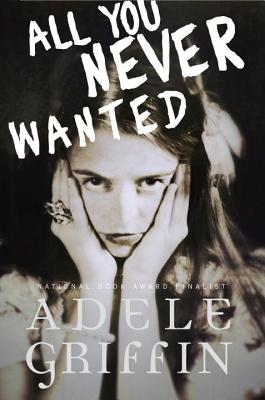
SH: After reading the initial first draft of the story I knew the jacket needed to be really dramatic and rich in feeling. I had been told by the editor that she and Adele both felt that the sisters should be featured together on the front cover. I found an image of two girls that seemed perfect at first but, then anyone who saw the image asked if the girls were lovers?! An image of sisters being sisterly in a dramatic way was going to be harder to find then I thought!
Did your publisher ask for your input on the cover design before the art dept started working? AG: Yes, I think in early days I scrawled my bad joined-girls idea on a napkin and I can only hope my editor just threw it away before showing the designer. Ack, embarrassing. SH: I do remember the editor showing me Adele's little napkin drawing! I have to admit I did get a little nervous when I saw it and thought "Oh no this author is going to be hard!" But—to my relief she was a dream author to work with—and ultimately we had the same vision for the cover.
What did you think the first time you saw your cover? AG: I've never seen such a beautiful cover. It was perfect the first time. I don't think that had ever been my thought since I saw the cover of the hardcover of a book I wrote called Amandine, all the way back in 2000. SH: Wow! Thanks Adele.
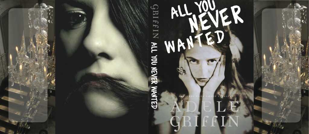
Did the cover change much from the original version you saw? AG: When we got the beautiful blurb from Sara Zarr, and we figured out a tagline for the back, I saw a few different versions of how Sarah was working with it. SH: Initially we wanted to put the quote from Sara Zarr and the great tagline "One Sister Has It All, The Other Sister Wants It All" on the front cover. But, I had a really hard time making all that copy work together on the front. In the end I do think we all came up with a great solution by putting the tagline and quote on the back cover. [See the full wrap, below]:
How did you find the cover image? SH: I was hoping not to have to do a photo shoot so, I kept searching for two girls together until I found this great image of one girl alone that I thought perfectly captured the character Thea. She was pretty but, distraught and kind of insane in a rich girl kind of way. I then started searching for a photo of the other sister, Alex, which I thought would be impossible because her hair is talked about so specifically but, it was a Christmas miracle—I found the perfect photo of Alex! It was at this point I really started to think about the jacket as a whole package. I was lucky enough to find two beautiful photos to capture the essence of the story's characters so well. I didn't want to give up either photo. So, why not make two great photos—one great jacket!?
How do you feel about the cover, in the end? AG: While at first I loved the differences in each image, I think the beauty of these dueling images is that they are both projecting the same themes of rivalry and seduction and power and empowerment, through two very different voices. It's a really smart, thoughtful cover on so many levels. Oh and I love the chandelier flaps. Such a brilliant touch-- especially if you've read the book. SH: All You Never Wanted was definitely one of my favorite books to work on this year. A great story always makes my job a lot easier and definitely more inspiring! AG: Smiling!
Thanks, Adele and Sarah! Such fun to hear from both sides, and this cover? Chillingly awesome, especially the full wrap.
What do you guys think?
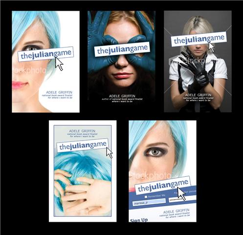
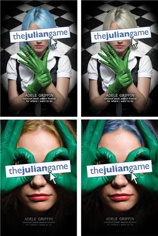
PS-Don't miss Adele's Cover Story for The Julian Game.


