lauren baratz-logsted

Cover Stories: 3 by Lauren Baratz-Logsted

Lauren Baratz-Logsted has a bunch of new e-books out, and with them come new covers! Here she is to talk about three: "Along with my husband Greg Logsted and our daughter Jackie, I created The Sisters 8 series (read some previous Cover Stories) for young readers ages 6-10 that launched in 2008. The ninth book was published this fall and even though the series has sold nearly 200,000 copies to date, the publisher has no intention of continuing at this time. And yet daily, I get emails from kids, asking for more books in the series; and those kids keep getting older with each day that passes. So, I decided to launch my own series, this time for 8-12-year-olds!

Cover 16Here’s the description of Book 1: GUYS AGAINST THE GIRLS:

There's trouble at Hat City Middle School! This first volume in an exciting new series by the author of the popular Sisters 8 series introduces readers to the six guys and six girls who make up a special class at Hat City Middle School. When a substitute teacher says something she shouldn't, the girls are outraged. Then their regular teacher makes matters worse, and everyone is outraged. Soon the guys and girls are facing off about everything, but will it end in victory or disaster? Told in alternating first-person plural viewpoints, GUYS AGAINST THE GIRLS is as original in its execution as any middle-grade novel out there today.

The cover for this was created by Griffin Ced. I said I wanted a red buzzer somewhere on the cover – because a red buzzer figures prominently in the storyline – and possibly some equations, since math is a great source of conflict in the book, and this is what he come up with. I love the way the school is literally splitting in two from the conflict and there’s my red buzzer, right over the entryway.

Here’s the description for Book 2 in the Hat City Middle School Series: ROBBIE KNIGHTLEY:

Cover 5a
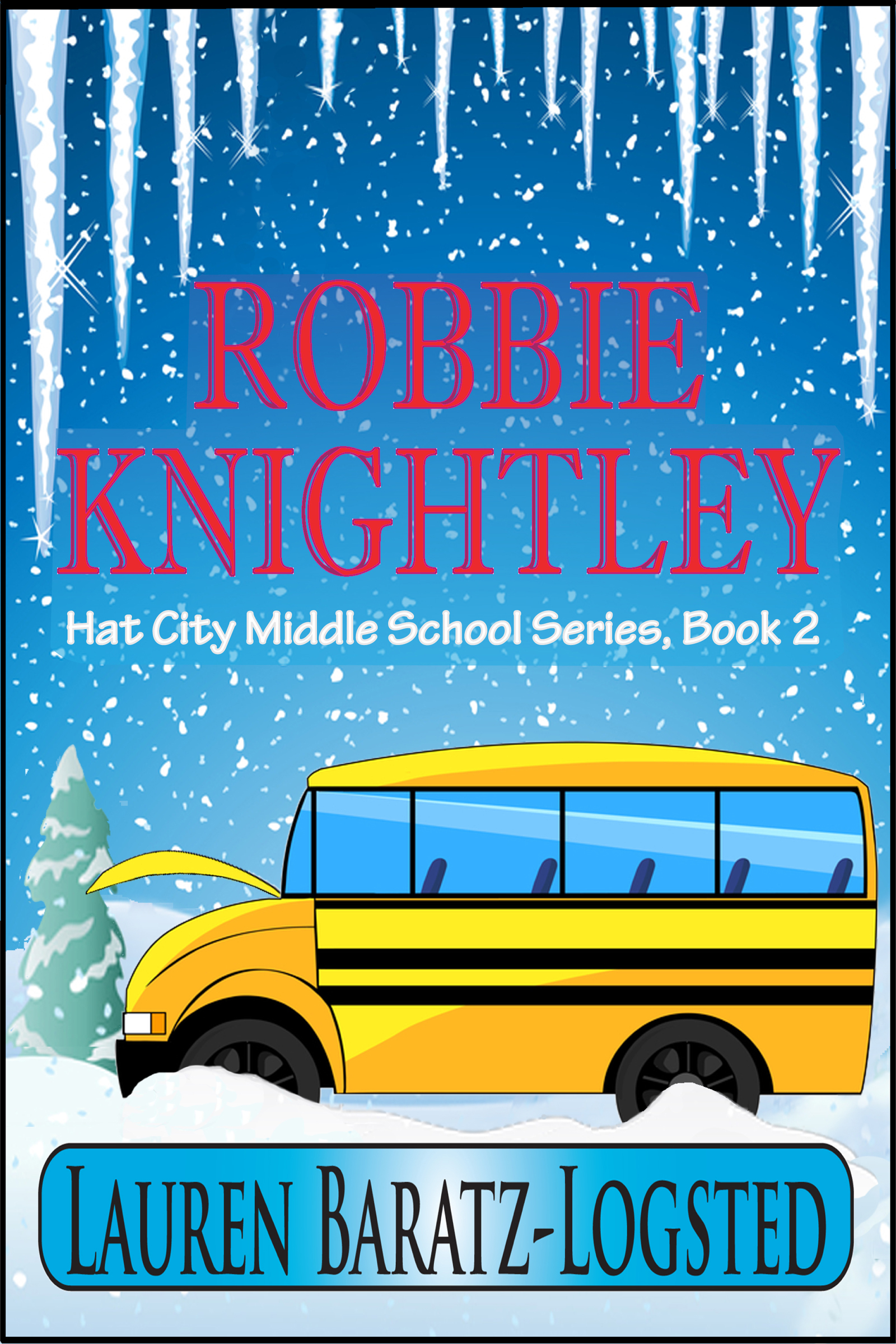
A modern-day Dennis the Menace, Robbie Knightley stumbles through life annoying the next-door neighbor, frustrating his teachers and perplexing his parents, who can't quite understand why he's so different than his six older sisters. When Robbie opens his Christmas presents prematurely without remorse for the second year running, his parents consult his therapist grandfather and Robbie hears his parents say they think there's something wrong with him, something missing. Robbie decides he'll get by in life by keeping his mouth shut and avoiding spending too much time with other people. But when a five-day class trip is unexpectedly moved up and he can't get out of it, Robbie fears the worst: that his friends will see him for who he really is, a boy with something missing.

"This time, I was a little more specific in my desires. I said I wanted a school bus stranded in a snowstorm and this is what Christiana Miller, working with Griffin Ced, came up with. Yes, I asked for a stranded school bus, but I never envisioned all these extras they gave me, like the icicles hanging from the top, framing it.

Jane2
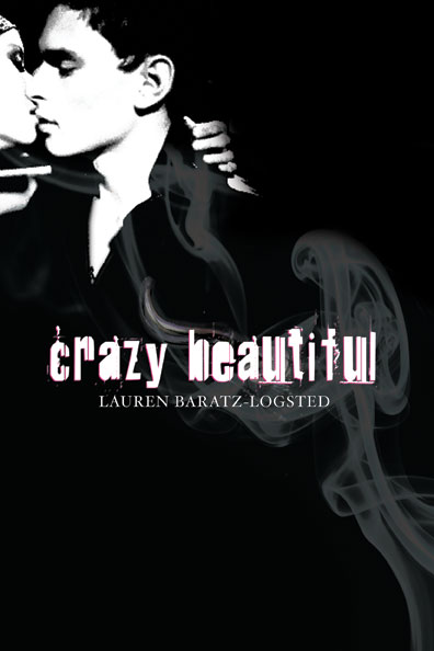
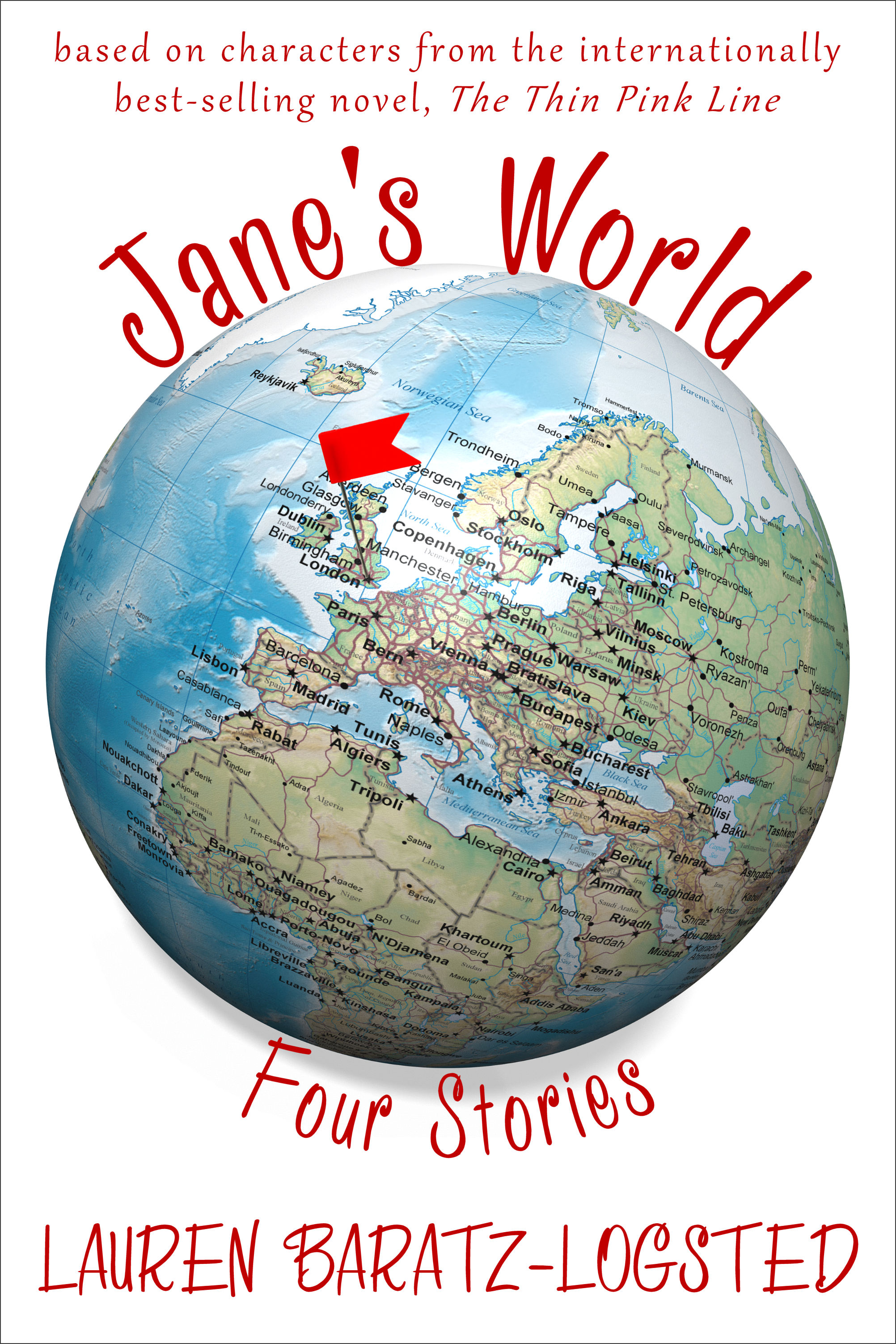
Last, but not least, JANE’S WORLD:

In 2003, The Thin Pink Line, a dark comedy about a sociopathic Londoner who fakes an entire pregnancy, was published. It was released in 11 countries and received a starred Kirkus review with Publishers Weekly calling it "hilarious and original"; a sequel, Crossing the Line, followed. Now, with the publication of JANE'S WORLD, four of the standout characters from those books - ditsy receptionist Constance; beleaguered blond bombshell editor Dodo; penny-pinching and bottom-pinching Stan from Accounting; and adorable baby Emma - all get to finally tell their sides of the story of what it's like being in the orbit of crazy Jane Taylor. No matter who's talking, it's always JANE'S WORLD.

"A couple of pieces of items you should know: The Thin Pink Line was indeed originally published in 2003 and, according to my most recent royalty statement, has sold over 172,000 copies worldwide to date. A few years ago, when Amazon had its Amazon Shorts program going, these stories were sold there as individual pieces. Then that program folded and they returned to living solely on my hard drive. But once again, through the wonders of e-publishing, they’re together, only this time as a single set. Back when The Thin Pink Line and its sequel, Crossing the Line, were published, I dreamed of doing a series of stories based on the characters. I wanted to call it Jane’s World and I knew exactly what I wanted it to look like. I told Rachel Cole at Littera Book Designs about my vision and this is what she gave me: exactly what I wanted.

"Three books, three different covers, three different designers. Through listening to what I wanted – and sometimes knowing what I wanted even when I didn’t know! – I ended up with all of this.

"So, I know what I think of these covers – love, love, love and love. Now what do you think?"

Thanks, Lauren! I always think it's interesting when authors work on covers themselves. Jane's World is my favorite of these three, maybe because I'm drawn to older-reader covers.

What do you guys think?

Cover Stories: The Sisters 8 Finale!

Lauren Baratz-Logsted has been here many times sharing Cover Stories, and now the final book in her Sisters 8 series (which she writes with her husband and daughter) is out! You can read the Cover Story for the first two books here.

Take it away, Lauren!

"On August 7, the ninth and final volume in The Sisters 8 was published. The Sisters 8 is a series for young readers, that I created with my husband and daughter, about octuplet girls whose parents go missing one New Year's Eve.

"From the time we sold the first book to Houghton Mifflin Harcourt, I was curious about what the cover would look like. Perhaps more than any area of books I can think of, series for children are defined in the public mind over a long period of time by the packaging. Can you imagine Harry Potter or Junie B. Jones with a different style artwork on the cover? Try switching the two styles in your mind. Does your head hurt yet? So, as perhaps you can imagine, I was nervous.

"All I can say is, the day HMH decided to go with Lisa K. Weber to do the cover and interior illustrations, it was a great day for me. It's as though, with each cover (see a few at right), she's captured everything that I hope is special about the books.

"Take this latest cover, for instance. All eight sisters are depicted but since there are no cats on the cover - the sisters each have a cat and one has always had a cover op in the past - I imagine young readers will wonder about that! Annie, the oldest octuplet, is making a chess move against a boy - a boy? on a TSE cover? - and wherever they are, it's snowing outside; which is odd since, when last we saw the sisters at the end of Book 8, it was August. Hmm...

"So much gorgeous artwork to look at, so much to think about...

"Not to mention, the amazing job HMH's own Carol Chu has done throughout the series with the design and lettering. Honestly, I could not be happier. And that's really saying something because, 25 books into my career, I have by no means loved all my covers. In fact...

"But that's another cover story for another day."

Thanks, Lauren! I've made no secret of the fact that I think the illustrations in this series are adorable and so cute, with an edge. What do you guys think?

Read more of Lauren's Cover Stories (for Crazy Beautiful, for The Twin's Daughter, and for The Education of Bet and Marcia's Madness (another Sisters 8 book).

Cover Stories: Interview with Regina Roff

Regina Roff designs book covers for Bloomsbury/Walker, and she was the one who created the final version of Lauren Baratz-Logstead's Little Women and Me (read that Cover Story from Lauren's POV). Now Regina's here to share her side of that cover's story, and share a few other covers she's been working on (like that gorgeous one at left):

"When I came onto Little Women and Me, it was already started by another designer. It was one of the first books I worked on at Bloomsbury/Walker, so it was a really exciting project for me. The art director explained the story to me loosely and showed me a few of the original cover comps (like the one posted below, right). The team liked that direction but they also wanted to see some other options.

"So, I sat down and read the story, to get a feel for the tone, mood, etc of the novel. I was instantly transported into the world that Lauren Baratz-Logsted created! I wanted to capture the feeling of being from the outside looking in on this classic story of LITTLE WOMEN. At first, most of my cover comps were similar to what had already been tried: they featured images of girls reading, etc. Then I thought it'd be interesting to see the main character sort of 'spying' on the characters in LITTLE WOMEN. I had a few options where a girl pulled back a curtain on a scene of LITTLE WOMEN, but they didn't have the impact I was hoping for. After looking and looking for more 'spying' images, I ended up finding the image on the final cover, the girl popping through a piece of paper. That's where everything started coming together, with the original LITTLE WOMEN artwork and the modern girl coming through the page.

"We worried that the unaltered LITTLE WOMEN artwork would make the book look oddly anachronistic, so I played with ways of making the art look more modern. I did a lot of Photoshop with creating 4 color separations, half tone dot screen patterns, and then splicing it all back together again. [um...Design speak redacted; translation: MAGIC!] It was my little design tribute to my love of pop art and Roy Lichtenstein. I liked the result because it almost looked like a colorized negative of the original art, so you could read the final image as the girl coming out of the book or the girl looking into the book. Originally, the main character was popping out over the faces of the LITTLE WOMEN characters (I thought I was being clever with a visual metaphor about how she 'becomes' a character, haha!) but the team thought it made the artwork less recognizable. In the end, I'm glad we ended up composing the image the way we did because it definitely makes it feel like the main character is an 'addition' to the LITTLE WOMEN cast of characters!

"Some other fun covers I've designed for Bloomsbury and Walker are Alexandra Harvey's latest Drake book BLEEDING HEARTS and the bind-up of the first 3 books, RULING PASSION (below). Those were great fun for me to work on because I love, love, love the Drakes, and I especially love Lucy. (Lucy and I have the same hair cut and cat eye glasses, not to mention a bit of a preoccupation with slaying vampires.)


"Most of the covers I've worked on won't be hitting the shelves until the Spring or Fall of next year, but those include Trish Doller's SOMETHING LIKE NORMAL, Allison Rushby's SHOOTING STARS and Amy McAuley's VIOLINS OF AUTUMN (all shown below).


"(Full disclosure: I almost missed getting off the bus during my morning commute because I was so engrossed in reading a draft of VIOLINS OF AUTUMN when I was conceiving the cover design. It's THAT good!!!) There are a LOT more coming out in the Fall, but they're not ready yet."

Thanks, Regina! It's really interesting to hear things from an Art Department perspective, and these covers you've been working on are lovely! What do you guys think?

Cover Stories: Little Women and Me

Lauren Baratz-Logsted has been here before, sharing Cover Stories for The Twin's Daughter, The Sisters 8, The Education of Bet and Crazy Beautiful. Her latest novel is Little Women and Me, about a girl who gets trapped in Louisa May Alcott's classic novel and considers changing everything (Beth lives! Laurie ends up with Jo!). How fun does that sound? Here's Lauren to discuss the cover:

"Sometimes, I have ideas for what my book covers should be and I get my wish. Sometimes I don't. But this time, I had absolutely no idea! How do you visually express the idea of someone getting sucked into a classic book or living inside it???

"Bloomsbury is very good about respectfully asking for input, but this time I truly had no ideas.

"The cover changed a lot! Originally, it was just a picture of a girl with a book open in front of her, like she's reading it. Across the front of the book, it had Little Women and Me in script. It was a pretty-enough cover but in no way did it express the plot of the book (right).

"When I first saw my final cover, I loved it! I don't know how they came up with it, but somehow they truly visually expressed the book. The biggest - and only - objection came from my daughter Jackie. Originally, the picture of the main character literally busting through the book appeared at the top of the book jacket, with the image from the Louisa May Alcott cover of the March sisters together appearing below. Jackie said it should be reversed, and they did that.

"It looks to me like they took the artwork from Little Women itself and then did fun things to it so that it looks like a real person is trapped inside the book and is peering out from it.

"At first, I thought it only represented Emily trying to look outside once she's become trapped inside the book. But then I realized it could also be interpreted as Emily trying to peek inside the book before she gets sucked in. I think it's just great. It definitely evokes the plot of the story and I can't think of another book jacket I've seen that's quite like it."

Thanks, Lauren! I agree that the first cover doesn't have much "grab" factor. The final design is much more energetic. What do you guys think?

Cover Stories: 7 at Unabashedly Bookish

Over at the bn.com blog... click through to read the full stories.twins.JPGThe Twin's Daughter by Lauren Baratz-Logsted. "My publisher did not ask for input before beginning work, but once they started coming up with covers--and there must have been over 20 iterations before the final cover was settled upon--my opinion was solicited every step of the way." Read more... sleepless.JPGSleepless by Cyn Balog. "I had always hoped that the moon would play into my book a little, because I am just a sucker for the moon (my first name means 'belonging to the moon')..." Read more... hungryforyourlove.JPGHungry For Your Love, edited by Lori Perkins. "Hungry for Your Love started as an ebook at Ravenous Romance. When I sold my short story 'Inhuman Resources' I never thought it would end up in a physical book store. Nonetheless, trends catch on quickly and within months this anthology about zombie love sold to St. Martin's Press. Suddenly zombies were big!" Read more... creativegirl.JPGCreative Girl by Katharine Sise. "When I first saw my finished cover, I actually got very choked up! There was something about seeing the cover that made the book feel very real and tangible. I could suddenly picture it on the shelf, instead of as a solitary project that I'd been working on for a year and a half from my living room couch next to my dog." Read more... enchanted ivy.JPGEnchanted Ivy by Sarah Beth Durst. "This cover is a painting of a real person. She emailed me several months ago and said that she was the artist's model. I love knowing that there's a real person that looks like Lily out in the world!" Read more... 10wayseloisa.jpgTen Ways to Be Adored When Landing a Lord by Sarah MacLean. "Romances have a really particular look--you know what I'm talking about... the ravishing (sometimes ravished) beauty, the handsome gentleman, and the famous clinch. Now, some people don't like the idea of a clinch... but I love them. They tell me that the book in my hands is a broad, sweeping love story, and that it's going to end with a happily ever after that will leave me sighing and wanting more." Read more... doggy.jpgThe Doggy Divas by Lauren Brown. "I was adamant that the cover not look too young as can be the case when writing about tweens and animals. We decided it needed to look sophisticated yet fun -- no easy feat. There's a fine line between going totally, over the top girly and keeping it 'cool' for lack of a better word." Read more...

Cover Details: Lauren Baratz-Logsted

Lauren Baratz-Logsted is like a book machine! She's got two new books out, and she's on a huge blog tour. Yesterday, she was at Satisfaction for Insatiable Readers talking about altering the ending to a classic! Tomorrow she'll hit NomadReader and discuss the Sisters 8's magic and talents. For her stopover here, I asked Lauren to pick one thing in each of the two new covers that she didn't notice at first after looking at her covers lovingly (as authors tend to do!).

Here's Lauren:

education of bet.jpg"For The Education of Bet: The girl on the cover is seated in front of a wall of similar-looking books. It wasn't until you asked this question that I squinted hard enough to see that the books say, Halsbury's Laws of England. Google informs me that it's the definitive encyclopedic treatise on the laws of England -- there are 56 volumes in the set! This makes me feel very good since, Bet so wanting to get a proper education, it would be disappointing if she were seated in front of the Victorian equivalent of a bunch of Danielle Steel titles. On the other hand, Google also informs me that Halsbury's Laws of England was first published in 1907. So unless Bet's a time traveler and I just don't know it, the scene depicted here could never have happened since The Education of Bet takes place in the 1800s!"

marciamadness.jpg"For The Sisters 8 Book 5: Marcia's Madness: OK, this one will expose me as being really lame, but before we get into that, I need to explain somthing about The Sisters 8. The eight sisters in the Huit family are octuplets, their names being: Annie, Durinda, Georgia, Jackie, Marcia, Petal, Rebecca and Zinnie. The sisters in turn have eight gray-and-white puffball cats, one for each sister, whose names are: Anthrax, Dandruff, Greatorex, Jaguar, Minx, Precious, Rambunctious and Zither. Without giving anything away, let me just say that the cats are uniquely connected to their little mistresses. And getting back to that cover: When I first saw it, with Marcia standing in the foreground, the other Eights behind her and her cat Minx by her side, I went back and looked at the previous four covers.'Isn't this amazing?' I said to one of my coauthors, 10-year-old Jackie Logsted. 'The artist puts the cat on the cover that goes with each featured sister!' Jackie gave me a look that might have been withering on a less cheerful child, as if to say, 'Really, Mom? You're only noticing this for the first time now?' See what I mean - lame, right? So how the cover makes me feel is: 1) amazed and grateful that our illustrator puts so much detail into every cover; and 2) lame, really lame."

Ha! I loved having Lauren take this in-depth look at two very different covers. Check out these two new books, and let me know what you notice. Have you ever really studied a cover and discovered some extra cool detail? (Yes, you know I'm cover obsessed.)

Happy Friday!

PS-Read Lauren's Cover Stories for The Sisters 8's first two books and Crazy Beautiful.

Cover Stories: Crazy Beautiful

The prolific Lauren Baratz Logsted's new novel, Crazy Beautiful, is getting major buzz. Just check out these reviews from Angieville, The Compulsive Reader and GreenBeanTeenQueen. Raves! cb.jpgAnd the cover is dark and compelling, so of course, I had to ask for a Cover Story. So here's Lauren:

"When I thought about the cover, I knew I wanted there to be a hook on it, since Lucius Wolfe has prosthetic hooks in place of hands.

"It came up during a visit my family paid to Houghton Mifflin Harcourt in Boston to discuss The Sisters 8 series for young readers [read that Cover Story here!]. I said I wanted a hook and my editor agreed there should be one.

"When I first saw the cover, I was overwhelmed. I'd envisioned a realistic hook, not the wispy, smoky hook that you can barely see for what it is, but I absolutely loved it. HMH does great covers.

"My editor is wonderful. With each cover, she says something like, 'Sales loves this, but the most important thing to me is: What do you think?' Who knows? She may just be the world's greatest politician, but she always makes me feel like my point of view matters.

"However, no further comments or suggestions were needed from me, other than: 'I love it - you people rock!'

"The photo of the couple is by Harry Vorsteher, the photo of the hook is by Sean McHugh, and the jacket design is by HMH's own Carol Chu.

"I just think they did an amazing job and the reaction to the cover by the YA blogosphere has been phenomenal, nothing like anything I've ever experienced before. One thing I hadn't noticed before I started answering these questions for you: At the bottom of the inside back jacket flap there's a much more pronounced hook. Neat. I'm so unobservant. Oh, and I like how when you remove the mostly black jacket the book underneath is hot pink with silver lettering."

Ooh, cool! I have an ARC that doesn't have that hot pink interior, so I'll have to find that in a bookstore. What do you guys think of this cover? (I also love the hint of pink in the title font... gorgeous.)

Cover Stories: The Sisters 8 by Lauren Baratz-Logsted, Greg Logsted and Jackie Logstead

S8-ANNIE-COVERwip.jpg Lauren Baratz-Logsted has written a lot for adults and teens, but now she's writing for a younger audience--and her co-authors are husband Greg Logsted and daughter Jackie. My eight-year-old niece has devoured the first books in The Sisters 8 series, and is anxiously awaiting the next titles. As for me? I love the illustrations by Lisa K. Weber. So here's Lauren telling her Cover Story:

"I had no idea about a cover! This was the first time I'd done something for such a young audience.

"The publisher did ask our preference on a couple of ways to present THE SISTERS EIGHT, finally settling on the font they have now with it written THE SISTERS 8. They also sent us links to some of the artists they were considering, but the final decision to go with Lisa K. Weber was theirs. Since they were the ones paying the illustrator--not just for the cover but also for about 20 interior illustrations for the books--we had no problem with them having the final say. Besides, they know what they're doing.

"When I first saw the cover, I was in love! And this was a huge relief. Truthfully, before seeing it, I'd been very nervous. I've had a lot of books published before, and have had a lot of different covers, but this was different. How the cover of ANNIE'S ADVENTURES came out would define the life of the nine-book series just as much as our writing would. Short answer: We were thrilled. Longer answer: Lisa K. Weber's illustrations surpassed our hopes and dreams. All three of us are in love with our covers."

S8-DORINDA-COVERwip1.jpggeorgia.jpgjokes.jpg

A short and sweet story that hinges on a very quirky/cool illustrator--yay! What do you guys think of these covers? Of these four, I like the first one best, maybe because of the snowy background and the gorgeously cold blue.

I'd love to hear what anyone thinks of illustrated covers vs. photographic covers. I'm a fan of both--either can be done well (or badly) so it just depends on the execution, I think. You guys?