robin wasserman

Cover Stories: The Waking Dark

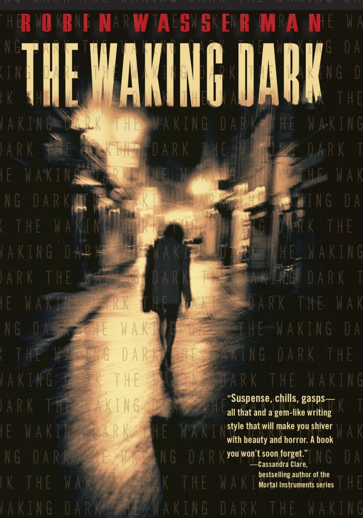
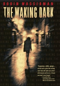
The-Waking-DarkIn a starred review, Booklist called Robin Wasserman's latest novel "a horror story worthy of Stephen King... violent, edgy, well-written, and foreboding." Eek! Might be too scary for me because I am a total 'fraidy cat. But I love Robin's writing, so... I'll chance it. Robin's also has a great Cover Story for The Waking Dark. (Read on for how you can win a paperback copy of her previous novel, The Book of Blood and Shadow!)

Here's Robin:

"There are some books—like my last novel, The Book of Blood and Shadow, that do their best to defy all attempts to match them with the perfect cover. Random House went through about a million concepts before settling on one we all loved, and then, when it came time for the paperback, went in a radically different direction all over again. (Which, for the record, I love even more.)

"There are, inevitably, other books (and I’m not linking to anything here, so you’ll have to use your imagination) that end up with covers that never feel quite right, at least to those of us who wrote them. (Insert caveat here about how it’s probably a good thing that authors don’t get to choose their own covers, especially when they’re authors like me, who are artistically challenged and have no idea what makes for a pretty, much less commercially viable design.)

"But every once in a while, if you’re lucky, there comes a book—or rather, some magical moment of alchemy between a book, a designer, an editor, and a marketing team—that hits it out of the park on the first try, seemingly without even trying. (Easy for me to say there’s no trying involved, when I’m not actually the one who has to glare at my computer until a cover design materializes.)

"I think The Waking Dark is my best book, but more than that, I love it more than anything I’ve ever written. This book feels like a piece of me in a way that no other novel has. On top of that, it’s a dark, prickly, scary story that hopefully has the potential to appeal to a bunch of different kinds of readers, all of whom (I feared) could be easily alienated by the wrong cover.

"All of which is to say that I was really nervous about what my publisher would decide to put on the front of this book.

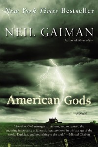
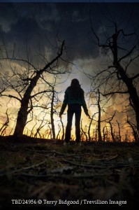
"As usual, my very kind editor welcomed me to send along any design thoughts I might have, even when we both know I’m hopelessly useless at this kind of thing. And, as usual, I swallowed my incompetence and sent along some images I’d collected that captured the feel I was hoping for:

american_godsonHBO1 00048189-2 tumblr_inline_mhg5hoJCqx1qz4rgp-3

"I also offered this very helpful and specific advice:

"I would really love this cover to scream, 'This book is not like all the others!'...in a completely non-alienating way. No tall order, right? :)

"It was actually a very tall order, and I don’t know how they did it. But they did. (I figure it’s okay to brag about this cover, since I had not a single thing to do with the making of it.) This cover is, with a few design tweaks, the very first thing the designer came up with, which as far as I’m concerned means she’s a certifiable genius who should be given all the awards from now til perpetuity.

"I’ve loved a lot of my book covers, but never before have I gotten a cover where I fell in love at very first sight, where I thought: YES. This is the cover this book was always destined to have. (Sort of like how we all felt when Alan Rickman showed up as Severus Snape.)

"Then I opened an email from my editor, and found this:

The-Waking-Dark

"This cover is the book. Everything that I hope The Waking Dark will be is encapsulated in this image. Or, as I wrote to my editor thirty seconds later,

"Immediate, knee jerk reaction? I LOVE #1. LOVE IT!!!!! That is so in keeping with what I was hoping for that I can't quite believe it. Beautiful, sophisticated, creepy.

"I can’t help but notice what I neglected to say in that email: thank you. So let me say it now, for all the world to see. THANK YOU, to everyone at Random House, but especially the brilliant designer Kate Gartner, for somehow managing to translate my amorphous imagination into something beautiful."

Thank you, Robin! I'm already creeped out. If I get a hard copy I'm going to have to turn it over... wonder what the back looks like. Ack. So yes, it does what it's supposed to!

Now, to enter to win a copy of The Book of Blood and Shadow, just tweet about this new release, or comment on the Cover Story. Good luck! I'll announce a winner next week.
a Rafflecopter giveaway

Cover Stories: The Cold Awakening Series

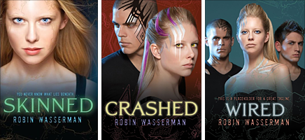
The amazing Robin Wasserman is back to share the story of the cover--and title!--changes for her latest trilogy. Here goes: "The last time I got to pontificate on this blog, I talked about how much I loved the cover my publisher had come up with (true) and how much we’d struggled to come up with the right title for the book (also true), and then ended with this: 'My editor promised me that after a few weeks of looking at SKINNED on the cover, I wouldn’t be able to imagine the book being titled anything else. She was right.'

"As they say…famous last words.

"Because fast forward three years later, and these books are getting brand new covers. And brand new titles to go with them.

"And I couldn’t be happier.

"Not that I didn’t like the original look for the trilogy, but who doesn’t love a makeover? (You’re talking to a girl who spent all of high school convinced that if she whipped off her glasses and shook out her ponytail in just the right way, she might become homecoming queen.) (Didn’t happen.)

"My editor first contacted me about the repackage about a year and a half ago (which means before the third book in the trilogy even came out!), and as I had the first time around, I jumped at the chance to weigh in:

'I'm so excited about the idea for new covers for these books! I'm the first to admit that I'm visually/artistically challenged, to put it mildly, but since you kindly asked if I had any thoughts on the subject, I took a look around to see what jumped out at me, and actually, I found that everything I gravitated toward had a sort of similar look, so I'm sending them along to you, in case anything sparks your imagination. You'd mentioned you were thinking iconic, which I think is a cool idea -- and I'm wondering what you think about using the *body* as a object, so to speak (ie instead of a chair or an apple or whatever), since that really gets at the heart of the trilogy.

I'm not talking about headless girl parts, so much as something like this - or even this.

In a sort of similar vein.

"We were all agreed that we wanted to move away from the photographic look of the original covers and find some kind of object that would really capture the theme of the trilogy. My editor and designer weren’t sure my idea of using the human body would work, so they suggested we try to find objects the evoked the same feel. I loved the way they were approaching it:

"'We’ve been talking a lot about the ideas of frailty v strength, something beautiful masking something unnatural, rebirth, etc—all with an iconic approach.' ---my awesome editor

"They told me they were going to look around from some stock photos of things that might capture this frailty/strength, natural/artificial divide, like cracked eggshells, frozen flowers, and silhouetted fruit.

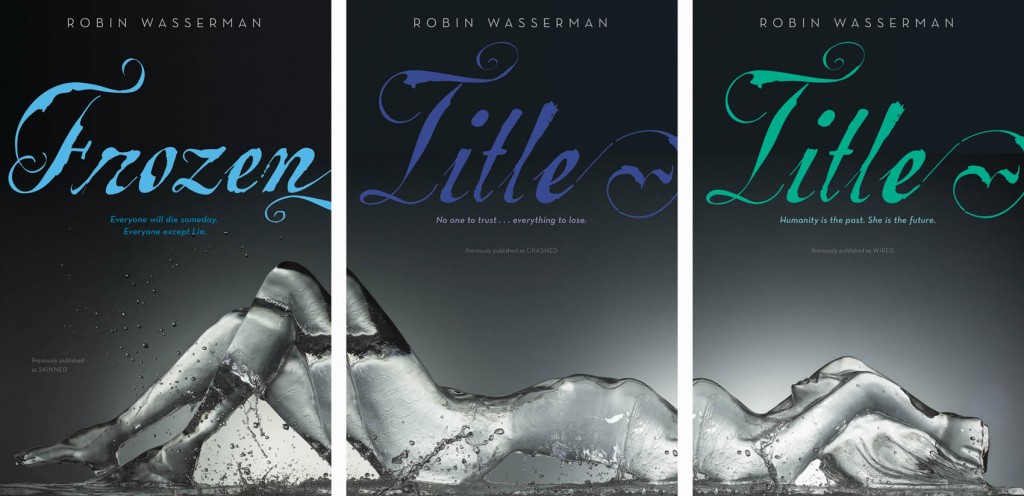
"Which I thought was a great idea…but not as great as the idea they sent over a couple weeks later:

"Apparently the designer came across the image and immediately fell in love – and you can see why! It took about five minutes for everyone to agree that these were perfect.

"Which left us with only one tiny problem… the titles.

"I’ve had a lot of people ask about why these books are getting new titles, and I usually say something like, 'Um…I don’t actually know? Sometimes that just happens? I guess?' So this time it occurred to me that instead of stammering like an idiot, I should just ask my editor. The Official Answer:

“'The original packages seemed to have missed the mark, perhaps because--as some people theorize--Skinned sounds a little horror-ish and Crashed and Wired feel too tech-focused. You were on the cutting edge of the swell of post-apocalyptic/dystopian, before we had a robust category in teen (in fact, we called your trilogy "realistic science fiction" which is still accurate but not currently "in vogue"), and the packaging across the YA industry would ultimately head in a starker, more iconic direction. Hence the change!

"Who knew?

"Of course, there’s a big gap between deciding we needed new titles and actually agreeing on new titles. And lost in that gap is a long, loooooong list of discarded ideas. Here’s just a taste of some of the title brainstorming:

DROWN TRESPASS SACRIFICE BARE EXPOSED DREAMER UNBOUND UNFORGIVEN EMPTY GUILTY FORGOTTEN

"Not to mention the unused trilogy titles! THE METAL DREAMERS SONGS OF STEEL THE LIVES OF LIA SONGS OF SELF

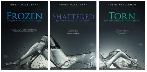
"You can see how this might have gone on forever. It’s kind of a miracle that we finally settled on something, and if you ask me, it’s something perfect:

"This has been a strange experience for me, since the original titles and covers have come to feel like they belong to me, while, for a long time, the new versions felt like they must be someone else’s books. Someone else’s beautiful books, to be sure, but not anything I had the right to call my own. It’s taken a lot of mental gymnastics – and a lot of gazing at the new covers on the computer screen – to convince myself that even with a new look and a new name, these are still my books. But I’m finally there.

"And I’m grateful for it. Because, if you want to know a secret--just between you and me and, you know, the entire internet--I love these covers about a million times more than the originals. I love these covers more than any covers I’ve ever had. Now I just hope the rest of the world will, too."

I love hearing this detailed story. Thanks, Robin! Um, if ever there were a reason to buy all three books in a series (besides the story, of course), these covers are IT. Am I right?

What do you guys think?

Photo Friday: Teen Author Festival

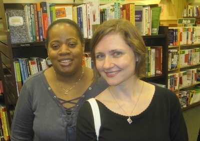
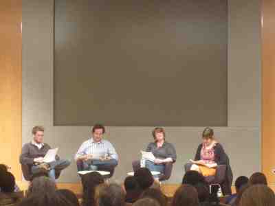
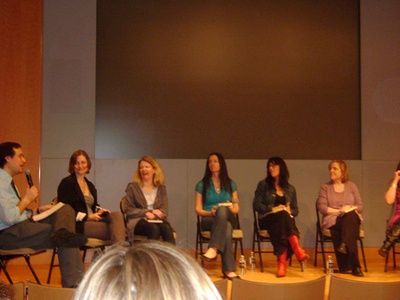
Just a few photos for fun. I missed taking them at Books of Wonder on Sunday (oops!) but here are a few--sorry they're blurry. My blog just does that sometimes.Me with Coe Booth, who's working on Tyrell II (not the official title, but yay! Tyrell is soooo good): IMG_1071.jpg The panel that needs no introduction, but what the heck? John Green, David Levithan, Libba Bray and E. Lockhart rocked their performances of each other's work and then readings from upcoming books. IMG_1076.jpg And my group reading at the Grand Army branch of the Brooklyn Public Library was super great, with an awesome rotating audience of students (L to R we are: Melissa Kantor, Siobhan Vivian, me, Robin Wasserman, Olugbemisola Rhuday-Perkovich, Emily Horner, Adrienne Maria Vrettos and Matthue Roth)! IMG_1077.jpg Ashley, whom I met on Friday during my panel on "The Boy You Can't Have," taped a ton of video that day, so if you want to see some reading clips, check out her youtube channel. She also sent me this lovely photo of the panel. That's David Levithan, me, Elizabeth Scott, Susane Colasanti, Robin Palmer and Maryrose Wood (we just missed Elizabeth Eulberg on the far right!): boypanel.jpg 'Twas a fun week! Y'all come next year, y'hear? More pics (and clearer version of these) up on readergirlz. PS-I also filmed a writing update vlog for Adele from Persnickety Snark -- her new feature asks authors what they're working on, so I talked about Small Town Sinners, my next book, and the one after that! I can't wait to see this feature evolve and hear from other writers. Great idea, Adele!