cover stories

Cover Stories: Over You by Amy Reed

Style: "Porcelain vivid"
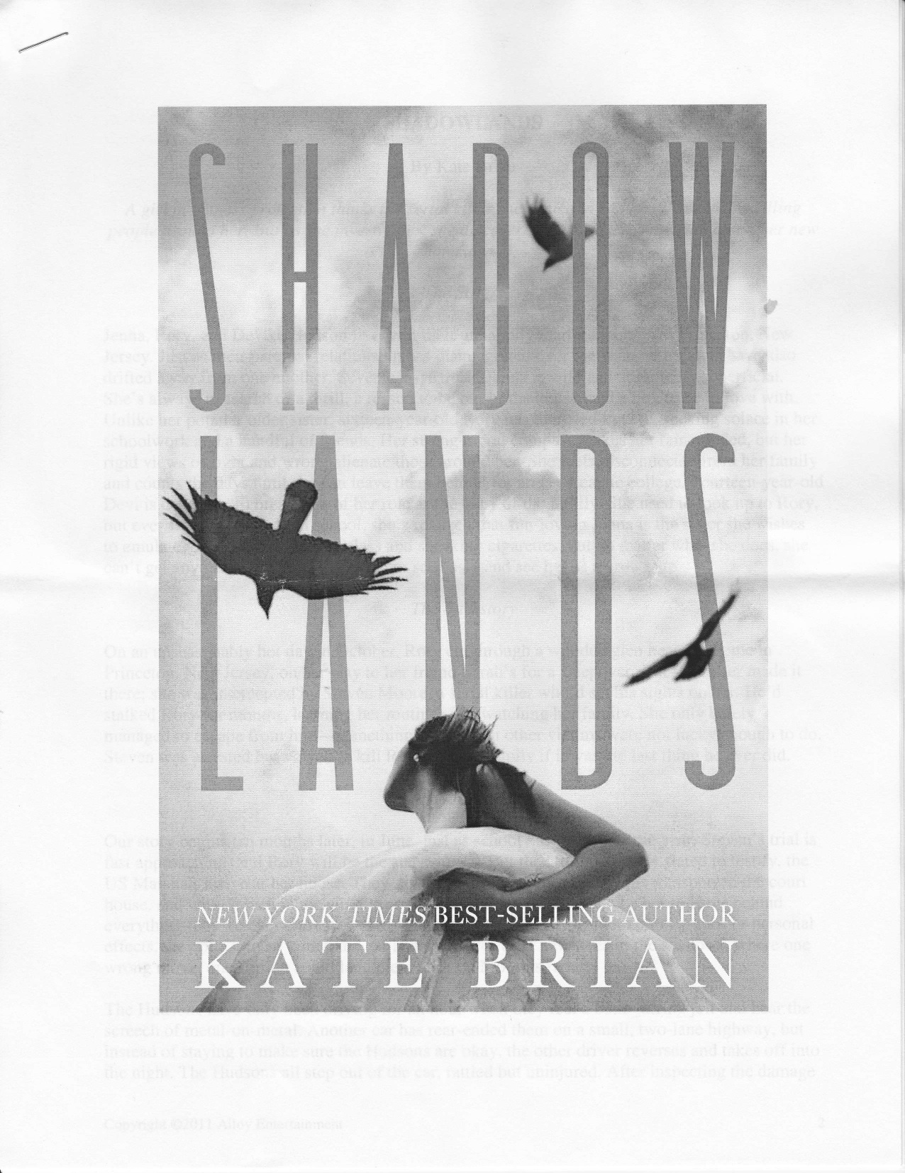
Amy Reed has shared her Cover Stories with me before, and her latest novel's face again uses white space and arresting fonts. Plus a show-stopping girl. Here's Amy with her latest Cover Story for Over You: "I loved how the designer used simple black line drawings in addition to photos on Clean and Crazy, so I was thinking he’d do something like that to portray the location. I pictured a photo of Max and Sadie (the two main characters) standing next to a hand-drawn ear of corn or barn or something. Luckily the designer had better ideas.

"My editor always asks me to describe the main characters before they start looking for models. I found this email I sent my editor:

Sadie: pink bob. I picture it a bit messy at all times, not like one of those wigs where everything's perfectly straight. There's something naturally sexy and playful about her. I picture her with a constant smirk on her face.

Max: long straight or slightly wavy hair, enough for a pony tail. Blondish-brown--the kind of hair girls complain about having who really want to be blonde. I don't think I specified bangs, but I think she could have longish bangs. Somewhat plain and girl-next-door-ish, but something definitely pretty and intriguing. Usually has a serious look on her face. (like a young, lighter-haired Jennifer Garner?)

Style: "Porcelain vivid""When I first saw my cover, I thought it was eye-catching and intriguing for sure. But honestly, I kind of wished it was Max on the cover instead of Sadie, since the book is really about Max finding herself. But I guess it’s the same for the cover as the story—Sadie’s the flashy one who gets all the attention, while Max is more quiet and stays in the background.

"The publisher is always open to my feedback, but I don’t think I had much to say about this one. One thing I’ve learned from both having my books published and working at a publishing company is that authors need to let designers do their jobs. Cover design is a combination of art and marketing, neither of which I know much about.

"The original idea was to put both Sadie and Max on the front, but that version was too busy and colorful (above right). They ended up putting Sadie on the front and Max on the back, which I think works well because it’s simpler and matches the covers of my other books with the use of white space.

Sadie make up
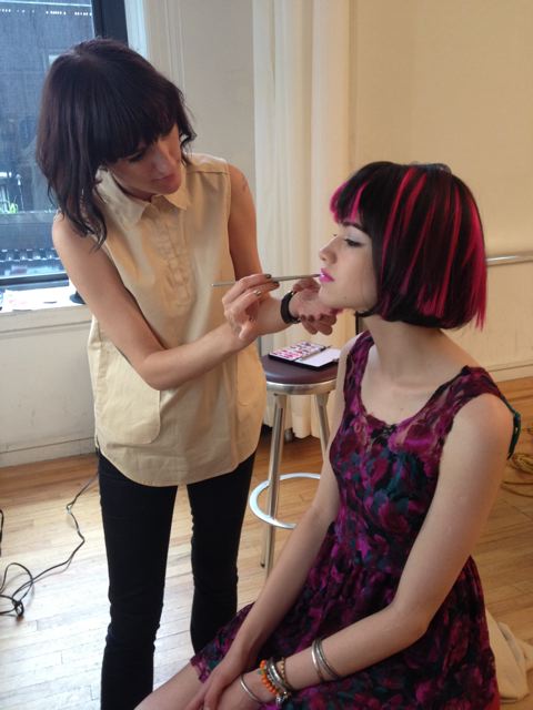
"I am so lucky that Simon Pulse chooses to invest so much in my covers by casting and shooting live models [see a shot from the shoot where 'Sadie' is getting her makeup done, right]. The best part is when my editor sends me behind-the-scenes photos from the photo shoots, like the lighting set ups and the models getting their hair and make-up done. My editor also told me a little about the models themselves—'Sadie' (on the front) had moved to New York from Lithuania three weeks before the photo shoot; 'Max' (on the back) had been living in New York on her own since fifteen to pursue modeling and acting."

Thanks, Amy! I love behind-the-scenes moments, and photo shoots that result in covers like this inspire me. I also think that the continuity between Amy's covers is very cool and recognizable.

What do you guys think of this cover?

Cover Stories: Burning

burning The cover of Elana K. Arnold's Burning arrested me instantly. I love sunlight play like this, and the dusty, western feel of it just threw me straight into dreamland. So I asked Elana how it came about. Here she is to share the story: "The Lovers card in Tarot plays an important role in the book, and I thought a piece of art inspired by it would be lovely. In my vision, the cover would feature a large tree, and underneath would be a dark-haired young woman with a blond young man, both naked, holding hands. But my editor told me we couldn't have naked people on the front of a young adult novel. Go figure! Here are a few Lovers cards I like:

Screen Shot 2013-07-22 at 3.04.28 PM


"When I  saw the cover of BURNING, my first thought was, 'That girl is WAY skinnier than Lala White.' Lala is dark haired, and voluptuous, and the girl on the cover is thin-hipped and kind of a blondish brunette. But I loved everything about the composition of the photograph--the sunspot obscuring the model's face, the colors, the washed-out road, the girl's foot front and center. She's on her way, that one. And I love what the book's designer, Stephanie Moss, did with the fonts and color choices. Really, the whole thing is so lovely.

"I was so excited when I found out that Random House hired a photographer to take the picture that became BURNING's cover. I immediately found the artist's page online and flipped excitedly through her shots. Her name is Eva Kolenko. I also friended her on Facebook and have enjoyed watching her posts about other projects she's involved with--photo shoots and her baby girl!

Eva Photo"Also, a very strange thing happened a couple of weeks ago. I was visiting Berkeley to help out with their Teen Writer's Camp, and my friend Erica and I stopped in at a bagel shop for breakfast. There, I saw a baby who looked familiar. I asked the baby's mother what the little girl's name was. She said, 'Parker.' Suddenly, I felt like I'd fallen into a parallel dimension. I said, 'Are you Eva?' Yes, she was. I said, 'You're the photographer who shot the cover for my novel BURNING.' Such a strange, small world, full of coincidences, made even smaller by modern social media. Here's a picture of me and Eva (right).

"I love the photo and the fonts of the cover. The letters in the title--BURNING--remind me of sticks ready to be set on fire. The girl, though considerably thinner than Lala, embodies the essence of her spirt, and the sprit of the book--a desire to break free, to hit the road."

Thanks, Elana! What do you guys think of this cover?

Cover Stories: Ashes to Ashes

Ashes to Ashes_new coverHi, guys! I did a Cover Reveal for my upcoming book, Ashes to Ashes, with bookish.com! Here's a teaser... "The movie Ghost was a point of inspiration for me, so as I thought about what the cover for "Ashes to Ashes" might look like, I flashed back to the poster for Ghost--it's pretty steamy! I usually send over a few images and ideas for tonal reference before my book gets a cover, but this time, the team at HarperCollins worked so quickly that I didn’t even know that my cover was in development. It was just suddenly… in my inbox...

Read the rest of the Cover Story on bookish.com! I'll give some more cover design details closer to release date (12/23!).


Cover Stories: Rogue by Lyn Miller-Lachmann

rogueLyn Miller-Lachmann has been the Editor-in-Chief of MultiCultural Review; the author of the award-winning multicultural bibliography Our Family, Our Friends, Our World; the editor of Once Upon a Cuento, a collection of short stories by Latino authors; and the author of Gringolandia, a young adult novel about a refugee family living with the aftermath of the Pinochet dictatorship in Chile. Her most recent novel, Rogue, features a main character with a mild form of autism, which Lyn also has. In an interview with the Times-Union, she says that she, like her character, "got into a lot of fights. I beat up boys. I literally cried every day at school. The stress was overwhelming. I made really good grades, and I hated school." Rogue also has a very cool Cover Story, and she's here to share it:

"My YA novel, Gringolandia, had an unusual and powerful cover closely connected to the story, and I was heavily involved in the design process. A small press published the novel, and in general, small presses do give authors far greater input than large corporate publishers. Thus, when I signed the contract for Rogue, I knew I’d get a chance to see the cover beforehand but I’d have little or no role in the ultimate decision-making. "That said, the result exceeded my wildest expectations. My wonderful editor, Nancy Paulsen at Penguin, commissioned Marikka Tamura, whose work has appeared in The New Yorker and other prestigious venues. We all agreed that the cover of Rogue needed a bicycle, because bicycles of all kinds play an important role in the story. Once we decided on the title of 'Rogue,' after the X-Men superhero with whom my main character, Kiara, is obsessed, we all knew the cover needed a comic-book superhero motif.

"When I first saw the cover design, the only thing that concerned me was the thought bubble that contained the novel’s first line: 'It usually took the new kids two weeks to dump me, three weeks at the most.' The reason is that when I was in school, I used to descend on the new kids, to make them my friends before the more popular kids stole them away. It never worked, and my own friendships never lasted more than a few weeks. So I was nervous about advertising unpopularity—Kiara’s and mine—on the cover.

"My editor did not agree with me. The one change that the publisher made from the galley to the finished copy was to change the thought bubble from pink to blue (see galley cover on the right). And here’s where we did have outside input—not mine, but my seventh grade student’s recommendation.

"When I told my seventh graders that my novel had been accepted, under the title KIARA RULES, and read them the first chapter, a student named Dan said, 'This is the kind of book I’d read, but not if it has a girl’s name in the title and pink on the cover.' So KIARA RULES became ROGUE, but the graffiti 'Kiara Rulz' on the cover recognizes the earlier title and Kiara’s generally fruitless efforts to be 'cool' and in control. And, of course, the pink thought bubble became a blue thought bubble. That was a good move because it turns out that boys do enjoy reading Rogue. It’s rare to have boys pick up a novel with a girl protagonist—The Hunger Games is a notable exception—so I’m thrilled that Rogue is in that company. At the same time, Kiara, like Katniss, doesn’t take on traditional gender roles, and every other character is a boy. Like many girls with Asperger’s syndrome, myself included, Kiara’s first real friends turn out to be boys rather than girls.

"The gender-neutral cover captures perfectly my main character, her tendency to get in trouble even though she wants to be good, her sense of being an outsider, and her superhero obsession as she struggles to find her own special power. It’s also an lively cover that hints at the outdoors setting and the action and suspense that should keep the pages turning."

Thanks, Lyn! I love the idea that seventh graders weighed in here and got a voice at the table! Can't wait to read it!

Cover Stories: Born of Illusion

born of illusion Guys, Teri Brown's latest novel, Born of Illusion, has 1920s NYC ambience in spades! It is so, so cool and creepy and lovely. Plus it's full of magic. The magician kind. I enjoyed it so much!

Here's Teri to tell the story of her cover (which also inspired an eyeshadow palette!):

"I had a sketchy cover idea of a trunk with a variety of magic items in it along with handcuffs and maybe a few old newspaper clippings of Harry Houdini's stunts. But, honestly, these were only half-hatched ideas and I couldn't quite make it come together in my head. When I told my publisher about those ideas, I got crickets back…

"And then when I first saw the cover, I gasped. It was so gorgeous. I was afraid, though, that the young woman looked a bit old for a YA. They were very interested in my input and l did tell them that the young woman looked a bit mature. I felt silly bringing it up because the cover was so stunning. It was such a small nitpick! But they were great--they tried to soften her jaw line just a bit to make her look a little younger.

"My editor and her assistant were actually looking through the stock art for a cover for a completely different book when they stumbled across this one. They knew immediately that this was the one. They just shot the cover for Born of Deception with the same model… I have seen some mock-ups and I don't know how they did it, but the second one is equally as stunning!

"A couple of interesting things about this cover… they actually employed a font artist to come up with the font for the book. They wanted it to have an old timey look, as the book does take place in the twenties. The artist took his inspiration from period magic posters, so it has a vaudeville show feel that I think is fabulous.

"The second interesting thing about this cover is that it actually changed the content of the story! After the cover reveal, everyone was talking about the pop of color from her blue eye… but in the story, Anna's eyes were brown like her mother's! My editor and I talked it over and agreed that readers would be horribly disappointed if Anna's eyes weren't blue. As it turns out, Harry Houdini's eyes were reportedly blue, so it worked out really well and added a layer to the story."

Thanks, Teri! I love this cover -- it's beautiful. And the same thing happened with the original Unbreak My Heart cover, except they had to age up the girl on the cover (see that story here). Also, I'm so glad the blue eye change fit well with the story -- kismet!

What do you guys think of this cover?

Cover Stories: When You Were Here by Daisy Whitney

Daisy Whitney shared the Cover Story for The Mockingbirds last year, and she's back with a new tale for her latest novel, When You Were Here (out in June!). By the way, Kelly J. at Stacked says this book is "so good it hurts to think about." Here's Daisy:

"When You Were Here has always been a tough book for me to imagine a cover for. That's because most of the book takes place in Tokyo, but the main character is very much an American teenager. It's also because the novel is about love, and loss, and grief, and joy and finding a sort of peace and happiness when you've been the one left behind, but it's also a romance between a boy and a girl. Given all that, I pictured cityscapes and neon lights and maybe a boy walking away from the reader...But that's sort of as far as I could picture a possible cover.

"I did share those thoughts with my editor and I also told her I wasn't fond of gray covers, that I didn't want a Tokyo vibe on the cover, and that I didn't want a sad or depressed looking boy on the cover. To be sure, my main character is sad at the start of the novel, but he's very much questing and yearning for happiness so I wanted the cover to convey some of the hopefulness of his journey.

"The cover here is the second version. The first version I wasn't wild about and I told my editor so. Without getting into the specifics, the first attempt felt too much like an adult novel for my tastes, and it also didn't have a person on the cover. I love photographic covers and faces, so when I offered some feedback on the first pass, I suggested a photographic cover, and sent along several stock photo options of teens that I felt came close to the vibe I wanted. My editor shared all the photos and my ideas with the design team, and they definitely took them to heart. So when I then saw this cover, I was happy! Because this cover says a lot now about the story - the boy is yearning, he's looking, he's not shying away from life or troubles. He seems a boy with a purpose, like my main character! I like the sun on his face, and the thoughtful, contemplative mood of the cover. And purple is my favorite color so I love the font.

"This cover is completely different from the first version, and this is much warmer and teen-centric and I think draws readers in, but also makes it clear that they'll be going on a complicated journey.

"I think it's a stock photo, and I'm really happy with this cover. Given that this isn't the easiest story to wrap up in a jacket, I think the design team did a great job. They are tireless and they tried many different directions, and I'm thrilled to be able to have an editor who values my input and who engages in an open dialogue about what's working and not working about covers. When I look at this cover now, I do feel as if this boy is my boy - as if he wants what my narrator wants, as if he's at that crucial crossroads in his life. This is a boy who's going to be a man of action, to seek answers, and who also is yearning and longing for so many things. And that's what the story is about. It's about a teenage boy and his journey through big love and big loss and his quest to find happiness in the here and now."

Thanks, Daisy! The emotions that this cover invokes are spot on for me. I love, love, love the sunlight behind him. So bittersweet. Can't wait to read.

What do you guys think?

Cover Stories: Criminal by Terra Elan McVoy

Cover w TaglineTerra Elan McVoy will be teaching with me at Smith College this summer (yay!) and she's back with a brand new book and a cover that somehow is both very in keeping with her past covers and also very different. Here she is to tell the tale: "I know I'm like a broken record at this point, but the case of Criminal's cover, as with all of my other books (save the paperback edition of Pure), I didn't have much to say when it came to the design, other than, 'BAM! This is awesome!'

"Since Criminal is in so many ways a very different book for me though (edgier and darker, with a much less confident protagonist), I was curious how the design team would work to set this book apart from the beautiful sweetness of the others, and yet keep it in line enough so that they would all look good together. I knew I didn't want anything that too strongly focused on the violence of the book (a gun, for example, or handcuffs or jail), though I did wonder about utilizing police CRIME SCENE tape or something like that.

"What makes the final cover so perfect to me, is that it is definitely different from the others (all black, notably different font), but it also blends with them. Like the rest (below), there's the title, and my name, a solid background, and one stand-out visual that makes it pop. (In this case, the golden bullet.) Even though there is a hint of the violence on the cover, it feels perfect because it is so simple, and so symbolic. That the bullet is tearing through the title, shattering it into little bits, is perfect not just because it looks cool, but because this violent act of Dee's completely shatters Nikki's life.

Screen Shot 2013-05-11 at 10.01.57 PM

"I will admit that when I saw that the cover was completely black, I did have a moment of, 'Oh no! How is this going to stand out now?' since my friends have had fun sending photos of Pure, especially, popping out on the shelf amidst a field of darkly-covered YA titles. I think the end result is so perfect and gorgeous, however, that I'll be able to handle it. All in all, I'm very pleased with the whole jacket, and I hope it entices readers to pick it up and read what's inside!"

Thanks, Terra! I really love your covers and the way that one symbol stands in as the full design. (See Terra's past Cover Stories for Being Friends With Boys, The Summer of Firsts and Lasts, After the Kiss and Pure.)

What do you guys think?

Cover Stories: Shadowlands by Kate Brian

Shadowlands_CVR_500px-2 Kate Brian, aka Kieran Scott, is here to share her perspective on the cover for her latest novel, Shadowlands. "I’ve never had the privilege of being asked for input on my covers, so I’m always holding my breath a little bit, waiting to see what the designers come up with. Most of the time, when I see the final result, I breathe a sigh of relief, and that was definitely the case with Shadowlands. I love, love love this cover. Every time I look at it I think I love it a little bit more. I love the moodiness of the colors, the gold shimmer of the title, the way the clouds and the birds wrap around the letters. It seems to be in constant motion. But I especially love the reaction it inspires from readers when they first see it. At an event the other day, a girl picked up the novel and said, 'Oooooh! Spooky!' And then she gave it a little hug. You really can’t ask for more than that.

shadowlands original"All that being said, I think I loved the original cover even more (right). The proposal for Shadowlands was put together by the awesome folks at my packager, Alloy Entertainment, and then pitched to a couple of publishers. When they originally sent out the proposal, they included a mock-up of the cover so the first thing the editors at the publishing houses saw was a piece of art that set the mood. That cover included a stock photo of a girl, who faced away from the camera, and was looking up at a flock of hovering and diving crows. You couldn’t see her face, but you could tell she was running. She had this voluminous skirt she was holding up with both hands, and with her face tilted toward the sky, you got the feeling she was terrified of the crows, or of what they symbolized, and that she was running for her life. Once the trilogy pitch sold, the powers-that-be decided to hire models and have a shoot, which is great, but the girl on the cover of Shadowlands the novel, as opposed to Shadowlands the proposal, just doesn’t convey that fear. She looks almost like she’s daydreaming. She’s beautiful and I love the movement of her hair and that she’s still looking up at the dreary sky, but I do miss that fear I felt with the first cover. There’s definitely a terrifying element to the book (girl on the run from a serial killer), so it was nice to have that emotion conveyed. Still, I’m more than happy with the final product, and happier every time I hear that, 'Oooooh!'

BH_70-nCcAELfal.jpg-large"As for the question that seems to be on every reader’s lips, the girl on the cover is supposed to be Darcy, and the girl on the back cover is Rory. This always confuses people because the book is from Rory’s POV and she’s a blond tomboy, so the cover doesn’t meet with their expectations. I have to admit, this was not the designer’s fault. Originally, the novel was from both sister’s POVs, something that changed during the editing process, but by the time the change was made the cover was already done. It was too late to replace Darcy with Rory. They both appear on the cover of the second novel, Here After (right), which is this awesome dark purple color and possibly even spookier than the first. The great thing about both covers is I think they’re intriguing enough to catch a browser’s eye and make them pick up the books, which is really all I want out of a cover! Reel ‘em in so they’ll read the flap. Keeping them there is my job."

Thanks, Kieran! I got a Hitchcock vibe from this cover from the start, so I was spooked immediately. I like seeing the girl more on the final cover, but I do love the fear in that first cover. Tough call.

What do you guys think?

Cover Stories: A Song for Bijou

bijouJosh Farrar's latest novel, a Middle Grade called A Song for Bijouhas a lovely cover that conveys a lot in one image. Here's Josh to talk about how it came to be:

"A Song for Bijou is a multicultural middle-grade romance, so I knew I wanted Alex and Bijou, the protagonists who share narrator duties in the story, to each be featured prominently.

"I was consulted throughout the process. I didn't have super-specific images of the characters in mind - except for Bijou's hairstyle, which is described in detail in the opening paragraphs of Bijou, but I wanted them to likeable, approachable, and no more sophisticated than their tween selves would be in real life.

"It took us a couple of tries to get there - the designer tried a couple iterations of a collage concept, but we didn't get any traction with it - but I absolutely loved the final version!

"As with most writers, my contract grants what is called 'cover consultation,' which means that editorial and marketing are encouraged to seek my input and to hear me out. (This is opposed to the much rarer 'cover approval,' which means that the author has to approve of the final version 100%.) My editor at Bloomsbury, Mary Kate Castellani, went to great lengths to include me in the design process. I have no idea how I compare to other authors in terms of the amount of input I give, but I love illustration and design, and it's fun to be involved in making those decisions.

"I wouldn't say that every single one of my suggestions was implemented, but that I was definitely treated with respect as a collaborator throughout the process, and the fact that I was but one of several people offering input was absolutely a good thing for the cover design. Whereas I've written just two books, my editor and designer have worked on dozens. They know what works, and what doesn't.

bijou original"The cover began as a photo collage, and ended as an illustration somewhat influenced by the poster for the film, Moonrise Kingdom. When the second iteration of the photo collage failed to excite the overall team, we all kind of converged on the idea that an illustration was the next logical direction. My editor sent me examples of several illustrators whose work they thought was good, and I picked 2-3 of those as favorites.

"One of them, Erin McGuire, nailed the cover concept on the first try. In fact, the very first drawing she submitted (right) was quite close to final illustration. She understood instinctively what she needed to do.

"If a book has a plot of any originality, finding the perfect stock photo is like searching for the needle in the proverbial haystack. My first book, Rules to Rock Bywas about a 12-year-old, half-Dominican girl in Providence, RI who plays the bass and wants to start a band. Try finding a 12-year-old, half-Latina girl playing a bass! It's not easy, and the initial cover-design attempts weren't cutting it. I was thrilled when my editor gave me the go-ahead to find my own model and photographer. My wife, Tayef, and I were already involved in shooting a book trailer for Rules, so we had a photographer come in and shoot a bunch of stills of the actress who played Annabelle, the main character. The people at Bloomsbury loved the photos, reimbursed the photographer, and used their favorite for the final book design.

Screen Shot 2013-04-22 at 2.10.23 PM

"Not until I actually saw the cover on the final, bound book (above) did I realize how nicely the cover design complemented the novel. A Song for Bijou's narration is split between Alex and Bijou, the two characters depicted on the cover, and the designer did a very nice job of re-purposing the main illustration twice to reinforce the relationship between the cover art and the story told inside. On the back cover, the same illustration is shown, but only from the waist down. And below each character's feet is a sample of the prose written from each character's point of view. Finally, the spine of the cover shows only each character's face, virtually gazing at one another from across the divide of the title. I thought this was a sweet visual metaphor for the distance Alex and Bijou must travel in order to find one another."

Thanks, Josh! I love the colors on this jacket, and the emotion between the characters is spot-on. What do you guys think?

Cover Stories: The Runaway King by Jennifer A. Nielsen

RunawayKing- Jennifer A. Nielsen's bestselling series impressed me with its iconic cover style. Here's Jennifer to tell the story of how it was created: "We had the cover of Book 1 (The False Prince, below right), so I guessed that Scholastic would try to stick with the 'broken' theme, but since covers are the realm of the publisher, I don’t think much about them while I’m writing. Besides, I have the visual art abilities of a toothpick, so my instincts aren’t great for design.

false prince"I wasn’t asked about input for Book 1, but with Book 2 I got to see a rough draft and make suggestions to my editor. I know that one of Scholastic’s goals with this series is to create an image that was more iconic, something that didn’t look like any other book. And I think so far they’ve succeeded.

"I really love the emerald green with the silver text, and I think the sword on it is just wonderful. The sword reminds me of Narsil, the broken blade in Lord of the Rings. I think it’s going to look great next to that deep blue of Book 1.

"Book 1 went through several different versions – I think there was a lot of input throughout the company and they worked really hard to find a cover that met a wide approval. Book 2 has some slight variations from the original version, but nothing more than tweaking what was already really lovely art.

"The cover design was done by Chris Stengel, the same illustrator who also designed for Maggie Stiefvater’s Shiver trilogy [read the Shiver Cover Story], and Ken Choi did the sword art. I feel indescribably fortunate to have both of them for artists.

"I love, love, love both of my covers! I think Book 1 does exactly what it should, which is to define itself as a medieval fantasy in which something has gone very wrong for the royals. The shattered crown is a wonderful symbol, and I think readers will come to appreciate its meaning.

"For The Runaway King, I think it’s wonderful that the broken image has been carried forward. Readers will find in Book 2 that Sage’s problems only get worse, and the cover definitely reinforces that."