melissa walker

Cover Stories: Ashes to Ashes

Ashes to Ashes_new cover
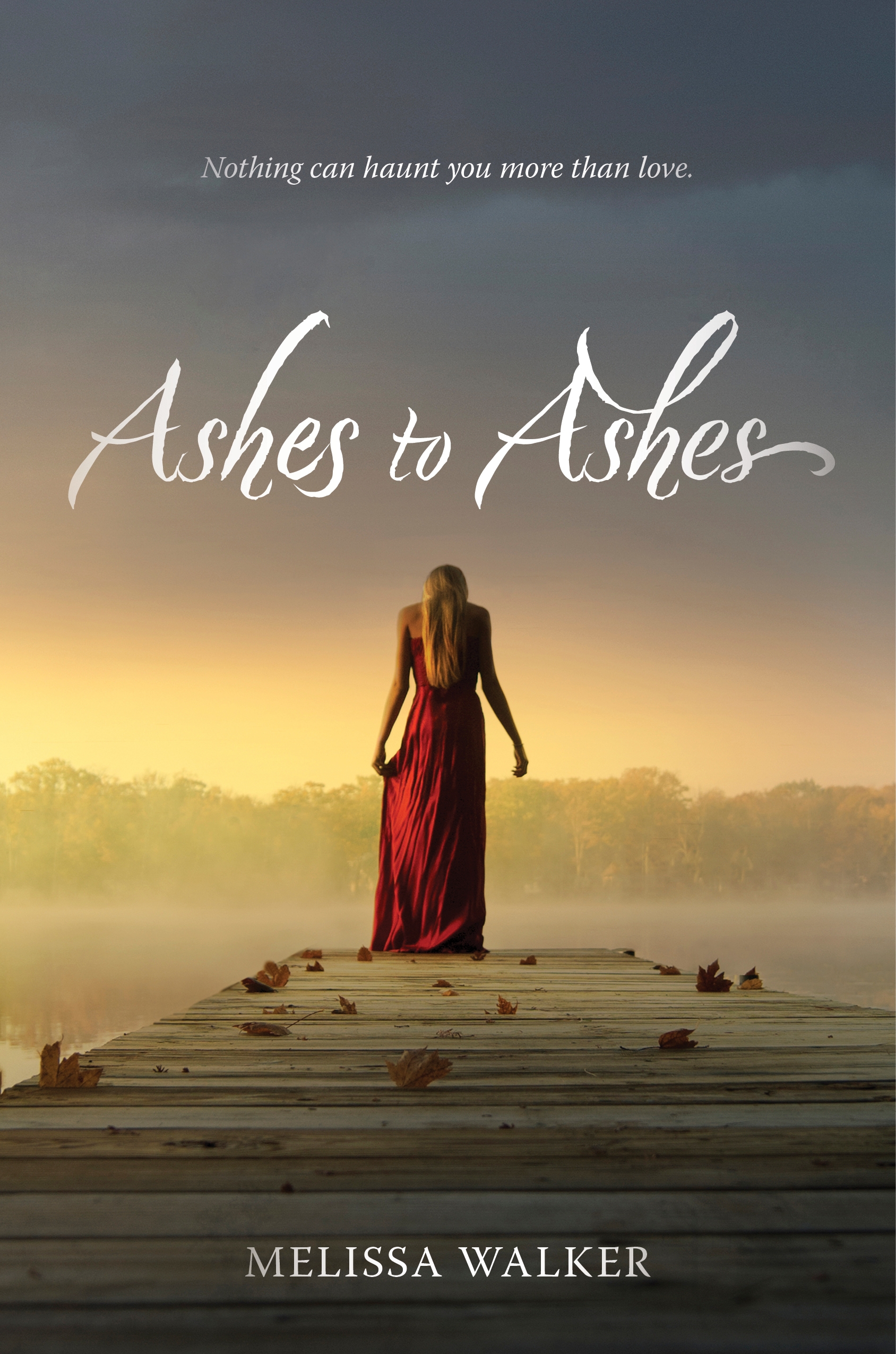
Hi, guys! I did a Cover Reveal for my upcoming book, Ashes to Ashes, with bookish.com! Here's a teaser... "The movie Ghost was a point of inspiration for me, so as I thought about what the cover for "Ashes to Ashes" might look like, I flashed back to the poster for Ghost--it's pretty steamy! I usually send over a few images and ideas for tonal reference before my book gets a cover, but this time, the team at HarperCollins worked so quickly that I didn’t even know that my cover was in development. It was just suddenly… in my inbox...

Read the rest of the Cover Story on bookish.com! I'll give some more cover design details closer to release date (12/23!).


Cover Stories: Unbreak My Heart

Writing my own Cover Story is always odd. But here goes. I sent Caroline, my editor at Bloomsbury, a bunch of inspiration images for this cover (a couple are below). You know, girl, sailboat, sun, water... okay, so I was kind of vague.


When they came back to me, it was with this first draft (right). And it DID capture the girl, sailboat, big sky stuff. But the boat? It wasn't right. So here's how I responded:

Thanks so much for sending along this design! I do like the echoing heart from SINNERS and the general feeling of being out on the water, glimmering sun, and mood of the girl. I have a couple of things I'd like to mention though:

1. That boat is a Catamaran, totally different from what Clem's family is on. I think because the boat is such a big part of the story, it matters. 

2. The pink feels a little like it veers over the cheese line. Maybe it's the pink with the heart, maybe it's the pink and purple of my name... it just feels a bit like it's trying too hard somehow to shout "Love Story!" Maybe there's a way to get a similar tone in there with a natural element, like a sunset?

And Bloomsbury was great, really took my concerns to heart. Everyone really loved the girl (myself included) so at first they tried to adjust the boat so it would look more like Clem's... but that just made it look less like a real boat. So they went in a totally different direction (left). I liked this image, though I had reservations. Here's how I responded:

My initial thoughts are: Cute. Feel like I've seen similar images before, but that's probably okay. Would like it to look more like a big river/lake and less swampy but I assume that can be done. Like the green dress and the sunlight--would love the sunlight to always be a part of my covers because I LOVED the lens flare on SMALL TOWN SINNERS, which was subtle but awesome, and there's one here too. Part of me misses the boat, but if it's included I do think it has to be the right sailboat, so maybe this is a better direction. 

And then they found another boat photo that everyone liked, and they sent me this:

I loved it instantly. The sail, the wind, the sun, the water... the girl. It felt so much like Clem! My agent raised the issue that the girl looked a little young, and Caroline said they could play with ways to age her up a little bit. Actually, here's what Caroline said exactly (so interesting!): I spoke with the designer and he is going to try making her chin and forehead a bit more prominent—basically elongating her face so it’s not quite so cute in a young way.  We’re going to try elongating her body a little as well.  I also suggested adding some wispy hair in front of her cheek.  I think when all of this is combined, she’ll look closer to 15/16.  Fingers crossed! 

I even got used to the heart (and started kind of loving it and hoping that all of my covers would have hearts from now on!).

Then the internal discussions at Bloomsbury kept coming back to everyone really liking the pink of that very first design. They missed it. I have to admit, I didn't. I really adored the green-blue-on-blue. I'm into blue. But I liked this cover and was willing to go with the colors that everyone thought would make the book most pick-up-able. And so here's where we landed:

I keep staring at it. I'm glad the pink is lightened a bit, and I like the contrast with the blue water. I really like it--it makes me so happy. It's out May 22, 2012. I hope you like it! (And that you'll like the inside parts too, of course!)

Happy New Year, you guys!

Photo Friday: Birthday and Bump

Today would have been my grandmother Carol's 101st birthday! Here she is graduating from the University of West Virginia:

And, by popular demand, here's a bump photo. I'm 9 months pregnant, people, so the phone photo fuzziness and dark lighting helps. (That's a Carolina Blue vintage mustang Dave and I spotted last night outside the Prospect Park Soiree--love it!).

Happy Fridays!

Win-It Wednesday: Apples, Apples, Apples!

The apple-bite contest is still going... I'll post the winning 5 entries at the end of the month! (And yes, that heart bite was officially photoshopped, as you can tell from the raw photo in the Cover Story and below.) In the meantime, there are posts popping up all over about Small Town Sinners (thank you!). I really hope you guys like it.

I did a Cover Story interview with designer Danielle Delaney yesterday on bn.com (that's another pic from photographer Joe Horne's shoot, left). Here's an excerpt:

"Really strong jackets tend to have a simple concept from the beginning that just clicks into place. What was interesting, was that this book had so many angles of how it could be advertised (such as, romance, coming of age, teen girl, religion, and small town themes) that it was at first difficult to figure out which should be the 'focus.'" --Cover Designer Danielle Delaney

I love hearing the story from the other side of the fence (the art department)! Read the full interview.

Also this week, I chose five stories from Figment to be featured reads! Log into the home page to check them out--there is such great writing on that site!

PS-f you see Small Town Sinners out in the wild (the "wild" being your bookstore or library), snap a shelf shot for me? It's still thrilling!

Cover Stories: Small Town Sinners, Part 2

Check out Part 1 of the Cover Story, about my slight input and inspiration photos, and read Part 1.5 of the Cover Story, in which I get nerdy about fonts.

Then, check out this interview with the awesome Joe Horne, who shot the cover photo! (That's the original, left). It hardly changed!

Melissa: What inspired the photo? Joe: My wife wanted to take a photography class at one of the schools around here. She wanted me to take it with her. I thought it would be something fun to do together. I'd been shooting pictures for over 30 years, but had never taken a class. So, we signed up. Our first homework assignment was to shoot fruit. I decided to shoot an apple that showed Eve being banished from the Garden of Eden after eating the forbidden fruit.

Melissa: What can you tell us about the shot? Joe: I talked to a beginning model, Taylor, about sitting for me. We went to a historic schoolhouse in Florence [South Carolina] that I was familiar with. I knew they had just clear cut some timber from behind the school. I wanted the background to appear ruined to show that she was no longer in paradise. It was kind of strange for Taylor. In previous shoots she had been the subject of the pictures. Now she was in the background with her face covered trying to look sad and remorseful. [Check out another photo from the same day's shoot, below left.]

Melissa: How did you find out that the photo was going to be used for the book cover? Joe: I have a profile for my photos on deviantART under GossamerDreams. I get messages from time to time. Some people like my work, some want to give me advice on how to make my pictures better, some just want to know if I have more pictures of a certain model. I got a message wanting to know if the picture could be used for a book cover. I didn't think the request was serious, so I ignored it. Later I got another request from the same person about the picture, so I emailed her and we talked. Of course I agreed. I'd never had a book cover before.

Melissa: What do you think of the final image on the Small Town Sinners cover? Joe: I am very pleased with the final cover. The only thing that was changed was the shape of the bite in the apple. Mine was just a bite, but they made it into a heart . I had adjusted the color and grain to make the apple stand out and give the rest of the photo a surreal effect.

Thank you, Joe! I'm so amazed we got in touch, and I adore this photo, which I think captures the feeling of Small Town Sinners so well! Be sure to look at Joe's portfolio--I have a feeling there are more book covers in his future. I love this one (right).

Stay tuned--tomorrow I'll talk to the cover designer for Small Town Sinners on bn.com!

Remember to try to win the book in the apple-bite challenge!

Cover Stories 1.5: Small Town Sinners, Title Fonts

(Read Part 1 of the Cover Story.) Ooh, I forgot! I wasn't sure about the title font at first (but I was wrong). The art department indulged me and did a bunch of mockups:   

Here are the mockups with in block, serif block and the final (image also brightened and apple changed, as noted in yesterday's cover story).

The final font  is definitely the best, right? I know I'm leading you to agree with me, but I really think so! It has bite to it (like this contest). And look how much more my name stands out! I didn't even notice that until just now. Really! (But I'm not above saying... I like it.)

Cover Stories: Small Town Sinners, Part 1

As you know if you read this blog, I'm kind of into covers. So when it comes to the subject of my own covers, I feel especially, um, assertive. I like to give inspiration images, write random things down, and generally insert myself to a point that might be annoying.

When my editor Caroline asked me if I had any cover ideas for Small Town Sinners, I sent her this email:

"I'm going to attach some images and give a little explanation of why they're in the mix for me.

"If we show LACEY: I picture her sort of like an early Sissy Spacek:


"The FEEL: I love the late sunset, dusty, small-town feel of the NYLON cover, the 'portrait' (really small, sorry), and that GUARDIAN ANGELS book. The color and tone of these images is really appealing to me.
 

**I do really love the close-up on one girl kind of cover, and an American gothic 70s feel seems right to me.

"Another Layout thought: The JAMAICA INN cover is a little random, but the grouping of the figures over this 'town,'the way it's laid out, appeals to me too, if we were to show a few characters and maybe some hint of Hell House (not sure how to do this!). OR Totally different direction: The Valley of the Dolls cover is obviously very graphic with text, but I do really like it, and I can see something like this working for Small Town Sinners just because the title feels geometric to me somehow, if that makes sense."

Caroline wrote back to me and said, "We’re definitely on the same page. The first thing that had come to my mind was the description of Lacey from chapter one and the idea of showing her in sort of a dusty sunlight—perhaps a light coming from behind that feels almost spiritual?"

The first version they sent me blew me away! But I felt like the coloring might make the girl seem a little dead (left) so the art department agreed to brighten it for the final (right). Now I love noticing that there's a sun spot in the lens--it's on the bottom right of this close-up (you kind of have to see it in person) and I adore that detail!


Also, I just noticed that the apple bite got bigger (and better, I think)! Remember to enter the apple bite contest to try to win a copy of the book.

So in the end we got a gorgeous cover that went with the first idea and I'm so glad that everyone was really into that concept! I have an interview with the cover designer and then one the photographer of that shot coming next week in Parts 2 and 3 of this Cover Story (you know I have to milk my own!).

What do you guys think of the small changes, the original ideas, etc? I'd love to hear!

Release is just a week away! Yay! Pre-order from your local bookstore or amazon or bn.com or anywhere and I will be super happy!

Photo Friday: Girls in Grass

I've been thinking a lot about my cover (mainly because I'm loving this apple-bite challenge--keep the entries coming!) and then I started to muse about girls-lying-in-grass and all the pretty covers I've seen with this theme. Here are four:

So that's my own Small Town Sinners, Before I Fall by Lauren Oliver (Cover Story), Between Here and Forever by Elizabeth Scott (Cover Story) and The Day Before by Lisa Schroeder (this one's brand new! I hope to do a Cover Story soon!). Despite the similarities, I think they all have really different tones. Do you guys know of any more?

Happy 4th of July weekend!

Win-It Wednesday: The Apple Challenge

Last week, I offered up five copies of Small Town Sinners, and this week, I'm offering up five more! (Last week's winners, chosen at random, are... Julia, Storybound Girl, Meghan Caprez, Nancye Davis and The Brain Lair!) Send me your addresses, guys! This week, another task is at hand. You've seen the heart-bitten apple on the cover. You've wondered: How did they do that? Well... photoshop. But that doesn't mean we can't try to heart-bite an apple. We can! And I have, more times than I care to admit since seeing my cover for the first time last fall (I'll share my attempts too... later). It's kind of fun.

So, to win one of the five ARCs up for grabs over the month of July, go get yourself an apple and try it! Then, email me a photo of your heart-bite attempt (melissacwalker2 AT gmail). I'll post the best pics and choose winners based on skillful heart-making.

I feel okay about letting you send as many photos as you like, because after all, apples are good for you. Get your whole family in on the apple-bitin' fun. Good luck!

PS-The book is out July 19th, and then you can just buy it instead of jumping through my silly hoops to win it, but isn't this fun?

PPS-Here's a closer look at that bite: