This big box of books is up for grabs, and I'm adding a signed paperback copy of Small Town Sinners!
small town sinners
Photo Friday: Paperbacks!
in Photo Friday
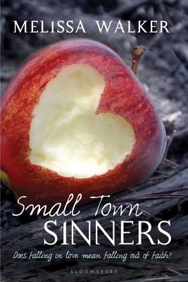
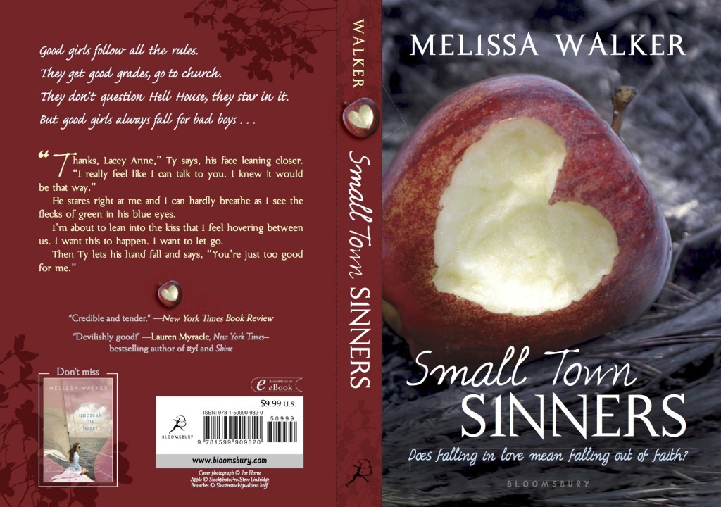
They're out! Here's the full jacket. Yay!
If you spot them in the wild, you can win books. Here's how. Happy Friday!
Win-It Wednesday: Apple Winners!
Guys, I loved this contest. Thanks to everyone who took a heart bite out of an apple for me in the past month. Below, the five winners: ♥ Alison (best shaping):

♥ Katie (best setting):

♥ Alexis (best lighting):

♥ Alejandra (precision points):

♥ MaryNellie (best photoshopping creativity):


Thanks to everyone who entered! If you've won, email me your address and I'll get your copy of Small Town Sinners in the mail!
And just in case you didn't win this one, here are a few other places where you can win a copy of the book...
Via the sidebar in this News & Observer story (ends Friday!)
Happy Wednesday!
Win-It Wednesday: Apples, Apples, Apples!
The apple-bite contest is still going... I'll post the winning 5 entries at the end of the month! (And yes, that heart bite was officially photoshopped, as you can tell from the raw photo in the Cover Story and below.) In the meantime, there are posts popping up all over about Small Town Sinners (thank you!). I really hope you guys like it.

I did a Cover Story interview with designer Danielle Delaney yesterday on bn.com (that's another pic from photographer Joe Horne's shoot, left). Here's an excerpt:
"Really strong jackets tend to have a simple concept from the beginning that just clicks into place. What was interesting, was that this book had so many angles of how it could be advertised (such as, romance, coming of age, teen girl, religion, and small town themes) that it was at first difficult to figure out which should be the 'focus.'" --Cover Designer Danielle Delaney
I love hearing the story from the other side of the fence (the art department)! Read the full interview.
 Also this week, I chose five stories from Figment to be featured reads! Log into the home page to check them out--there is such great writing on that site!
PS-f you see Small Town Sinners out in the wild (the "wild" being your bookstore or library), snap a shelf shot for me? It's still thrilling!
Cover Stories: Small Town Sinners, Part 2
Check out Part 1 of the Cover Story, about my slight input and inspiration photos, and read Part 1.5 of the Cover Story, in which I get nerdy about fonts.

Then, check out this interview with the awesome Joe Horne, who shot the cover photo! (That's the original, left). It hardly changed!
Melissa: What inspired the photo? Joe: My wife wanted to take a photography class at one of the schools around here. She wanted me to take it with her. I thought it would be something fun to do together. I'd been shooting pictures for over 30 years, but had never taken a class. So, we signed up. Our first homework assignment was to shoot fruit. I decided to shoot an apple that showed Eve being banished from the Garden of Eden after eating the forbidden fruit.
Melissa: What can you tell us about the shot? Joe: I talked to a beginning model, Taylor, about sitting for me. We went to a historic schoolhouse in Florence [South Carolina] that I was familiar with. I knew they had just clear cut some timber from behind the school. I wanted the background to appear ruined to show that she was no longer in paradise. It was kind of strange for Taylor. In previous shoots she had been the subject of the pictures. Now she was in the background with her face covered trying to look sad and remorseful. [Check out another photo from the same day's shoot, below left.]
Melissa: How did you find out that the photo was going to be used for the book cover? Joe: I have a profile for my photos on deviantART under GossamerDreams. I get messages from time to time. Some people like my work, some want to give me advice on how to make my pictures better, some just want to know if I have more pictures of a certain model. I got a message wanting to know if the picture could be used for a book cover. I didn't think the request was serious, so I ignored it. Later I got another request from the same person about the picture, so I emailed her and we talked. Of course I agreed. I'd never had a book cover before.
Melissa: What do you think of the final image on the Small Town Sinners cover? Joe: I am very pleased with the final cover. The only thing that was changed was the shape of the bite in the apple. Mine was just a bite, but they made it into a heart . I had adjusted the color and grain to make the apple stand out and give the rest of the photo a surreal effect.
 Thank you, Joe! I'm so amazed we got in touch, and I adore this photo, which I think captures the feeling of Small Town Sinners so well! Be sure to look at Joe's portfolio--I have a feeling there are more book covers in his future. I love this one (right).
Stay tuned--tomorrow I'll talk to the cover designer for Small Town Sinners on bn.com!
Remember to try to win the book in the apple-bite challenge!
NY Times Book Review: Small Town Sinners
in Other Stuff
In case you didn't catch it on twitter or facebook, look at this:

") The New York (effing) Times reviewed Small Town Sinners in Sunday's paper. And they liked it! And they compared it to Friday Night Lights!!!
The New York (effing) Times reviewed Small Town Sinners in Sunday's paper. And they liked it! And they compared it to Friday Night Lights!!!
Choice bits: "Walker has written a credible and tender evocation of the moment when a young person’s beliefs begin to emerge and potentially diverge from the teachings of a family’s religion... for teenagers raised in evangelical homes, as I was, the character’s spiritual life will ring absolutely true."
"Near the end, Lacey contemplates a verse from the prophet Isaiah: 'Come now and let us reason together.' It’s a good summation of what Walker asks of her characters and, by extension, of her readers."
Dream. Come. True. It's enough excitement to send a girl into labor (but hopefully it won't! Not ready!).
Happy Saturday!
Win-It Wednesday: Apple Challenge
 The heart-bite apple challenge is still going... read all about it here, and keep chewing on apples for a chance to win Small Town Sinners. They're good for you!
Other ways to win Small Town Sinners before it comes out (on Tuesday!):
★ Enter the Bloomsbury Teens monthly giveaway on Facebook.
★ Check out my twitterview on Stacked and enter to win.
Cover Stories 1.5: Small Town Sinners, Title Fonts
(Read Part 1 of the Cover Story.) Ooh, I forgot! I wasn't sure about the title font at first (but I was wrong). The art department indulged me and did a bunch of mockups:


Here are the mockups with in block, serif block and the final (image also brightened and apple changed, as noted in yesterday's cover story).
The final font is definitely the best, right? I know I'm leading you to agree with me, but I really think so! It has bite to it (like this contest). And look how much more my name stands out! I didn't even notice that until just now. Really! (But I'm not above saying... I like it.)
Cover Stories: Small Town Sinners, Part 1
As you know if you read this blog, I'm kind of into covers. So when it comes to the subject of my own covers, I feel especially, um, assertive. I like to give inspiration images, write random things down, and generally insert myself to a point that might be annoying.
When my editor Caroline asked me if I had any cover ideas for Small Town Sinners, I sent her this email:
"I'm going to attach some images and give a little explanation of why they're in the mix for me.
"If we show LACEY: I picture her sort of like an early Sissy Spacek:


"The FEEL: I love the late sunset, dusty, small-town feel of the NYLON cover, the 'portrait' (really small, sorry), and that GUARDIAN ANGELS book. The color and tone of these images is really appealing to me.


**I do really love the close-up on one girl kind of cover, and an American gothic 70s feel seems right to me.
"Another Layout thought: The JAMAICA INN cover is a little random, but the grouping of the figures over this 'town,'the way it's laid out, appeals to me too, if we were to show a few characters and maybe some hint of Hell House (not sure how to do this!). OR Totally different direction: The Valley of the Dolls cover is obviously very graphic with text, but I do really like it, and I can see something like this working for Small Town Sinners just because the title feels geometric to me somehow, if that makes sense."


Caroline wrote back to me and said, "We’re definitely on the same page. The first thing that had come to my mind was the description of Lacey from chapter one and the idea of showing her in sort of a dusty sunlight—perhaps a light coming from behind that feels almost spiritual?"
The first version they sent me blew me away! But I felt like the coloring might make the girl seem a little dead (left) so the art department agreed to brighten it for the final (right). Now I love noticing that there's a sun spot in the lens--it's on the bottom right of this close-up (you kind of have to see it in person) and I adore that detail!


Also, I just noticed that the apple bite got bigger (and better, I think)! Remember to enter the apple bite contest to try to win a copy of the book.

So in the end we got a gorgeous cover that went with the first idea and I'm so glad that everyone was really into that concept! I have an interview with the cover designer and then one the photographer of that shot coming next week in Parts 2 and 3 of this Cover Story (you know I have to milk my own!).
What do you guys think of the small changes, the original ideas, etc? I'd love to hear!
Release is just a week away! Yay! Pre-order from your local bookstore or amazon or bn.com or anywhere and I will be super happy!
Win-It Wednesday: The Apple Challenge Continues
This one will go on until the end of July, so grab an apple and get to biting! Recreate that heart and email a photo to me for a chance to win one of five early copies of Small Town Sinners! Full details here.